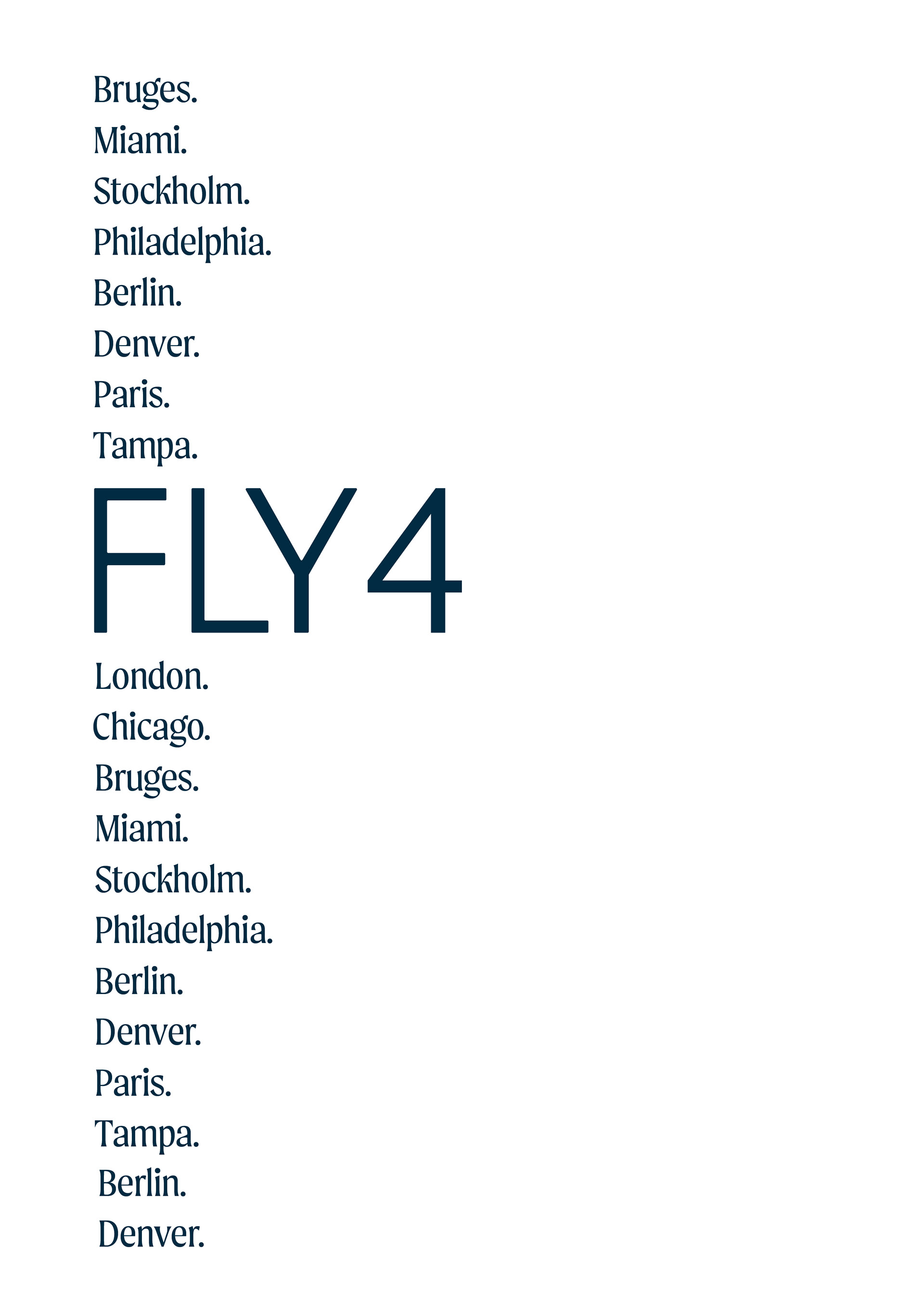
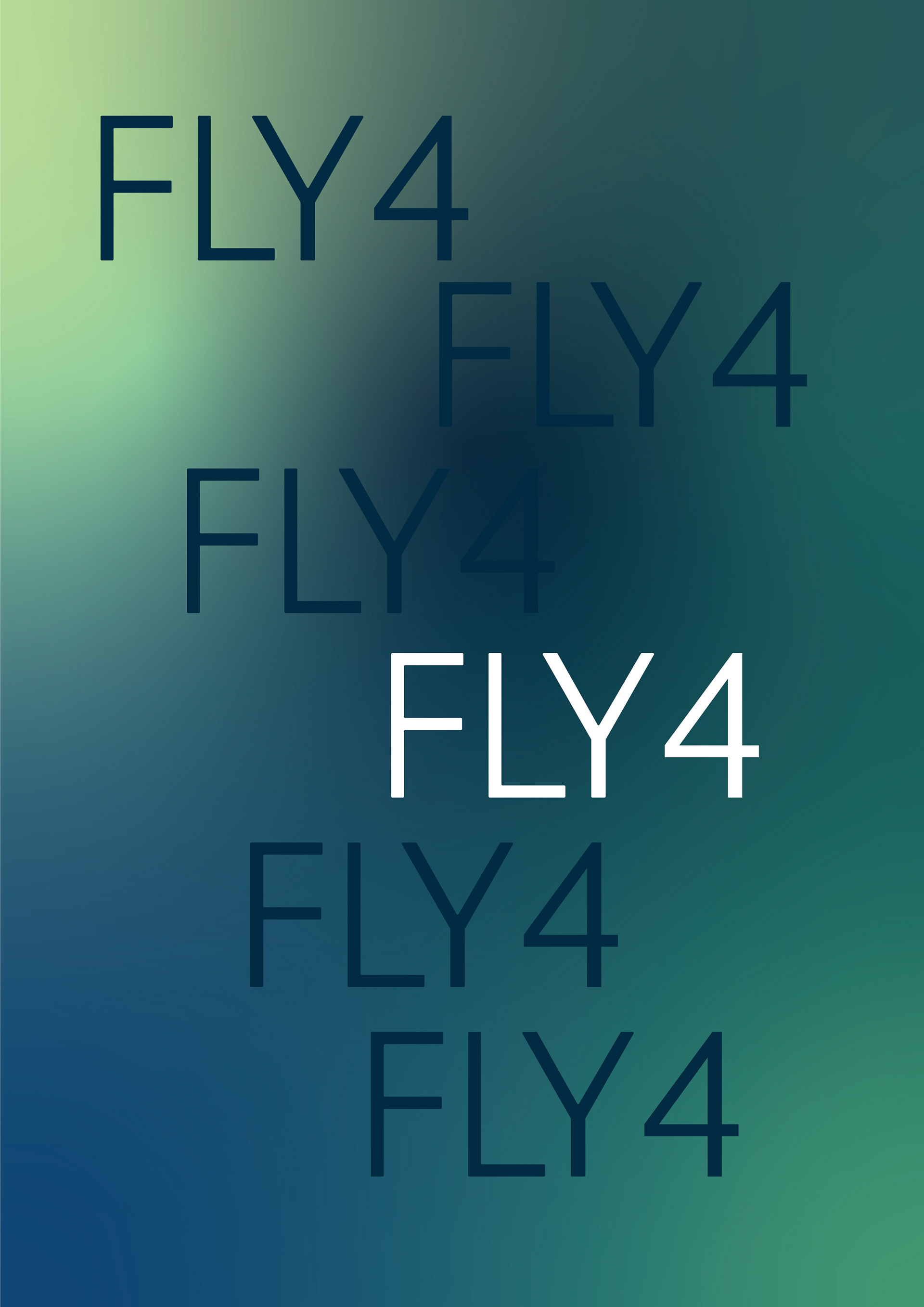
Tasked with creating a complete airline brand to service any clientele and any region in the world, I created Fly 4 airlines, a North American based airline focused on customer experience and satisfaction. Existing airline corporate identities were used to inform my airline concept, clientele, and destinations.
Below is my process work and final designs for this project.
Final Designs
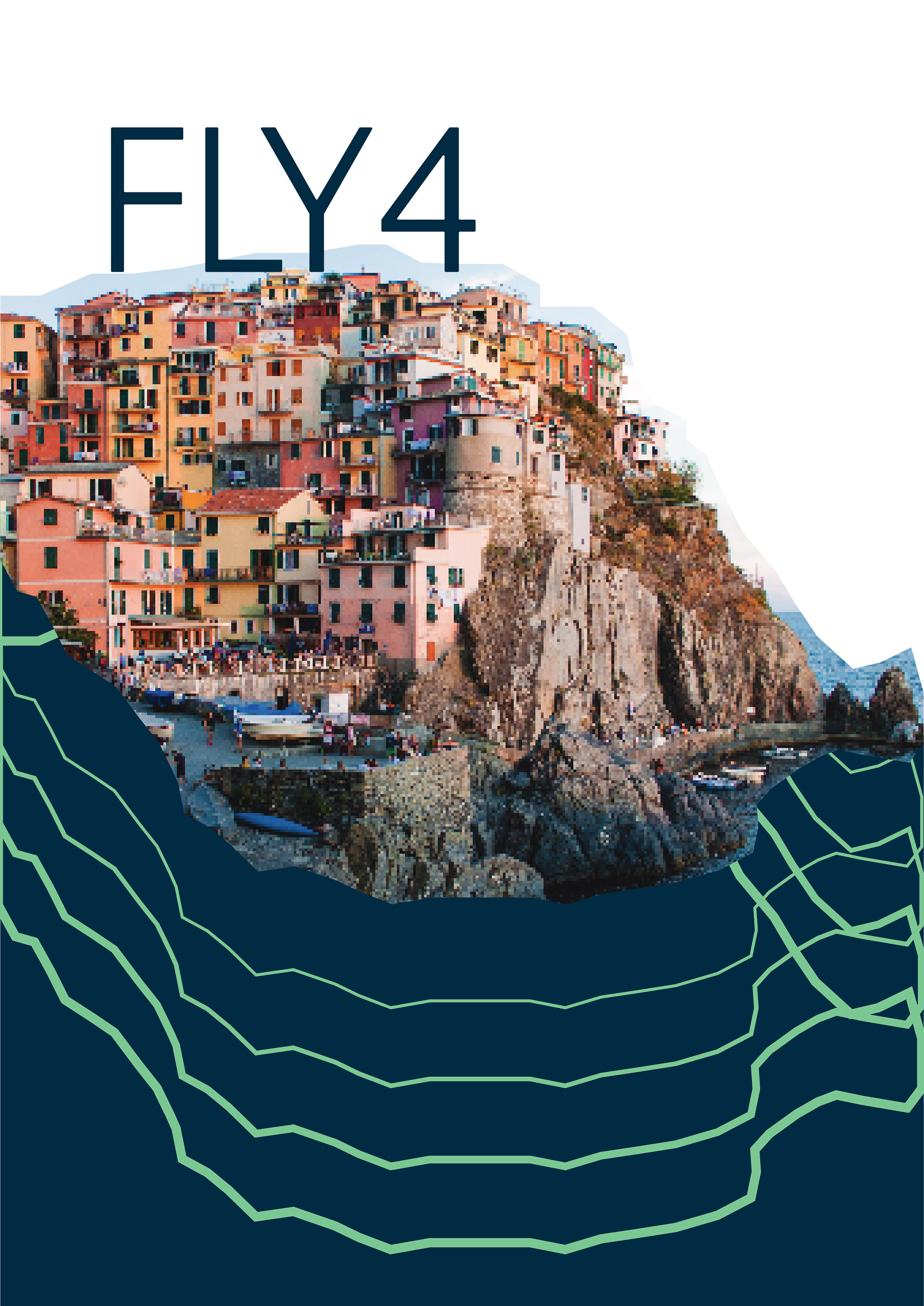
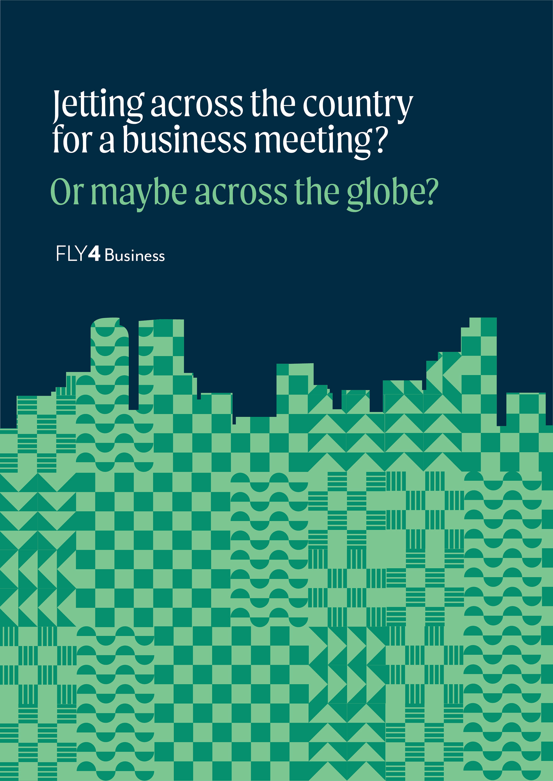
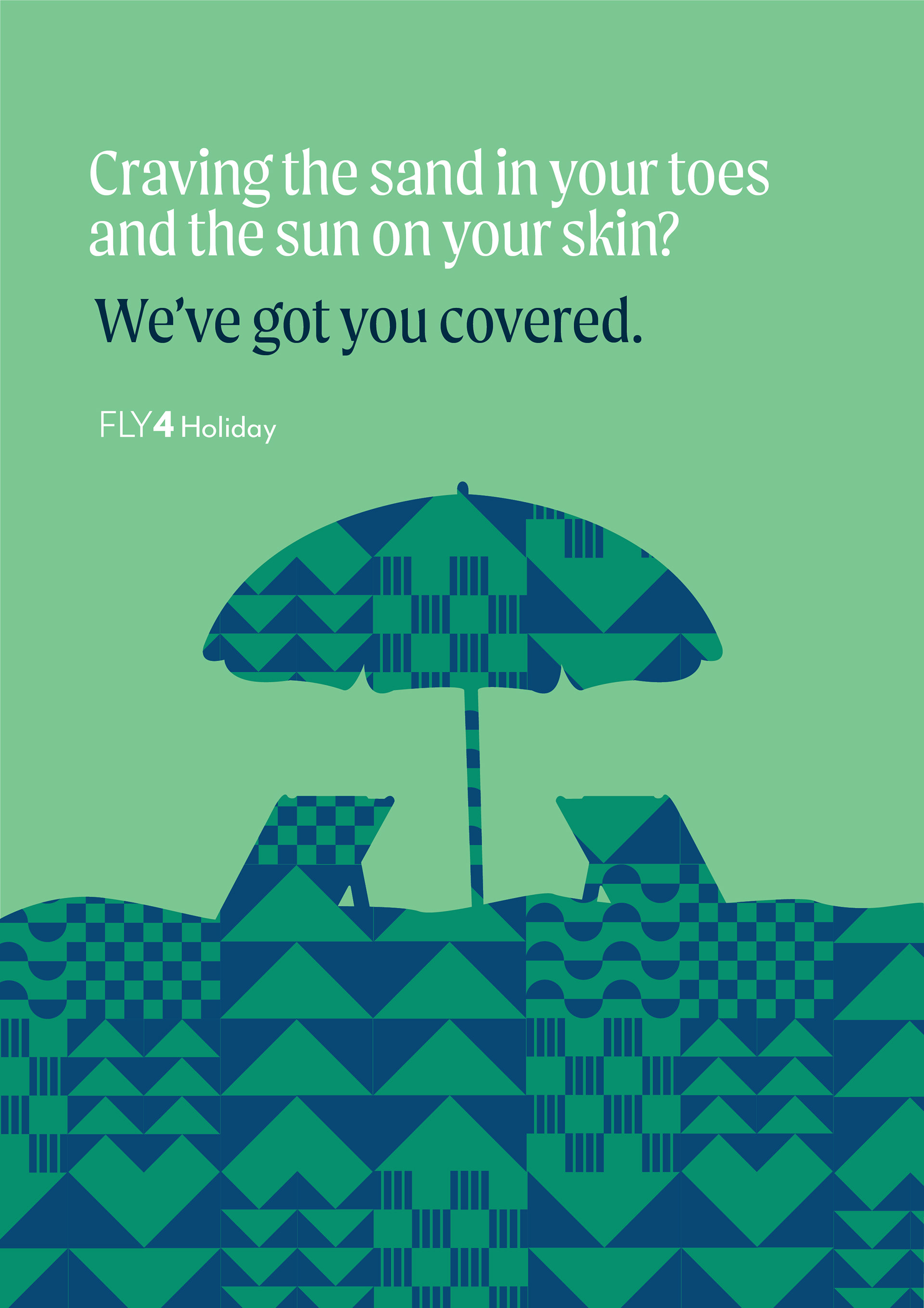
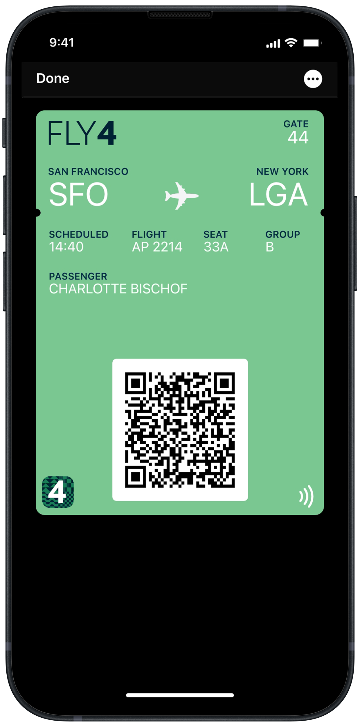
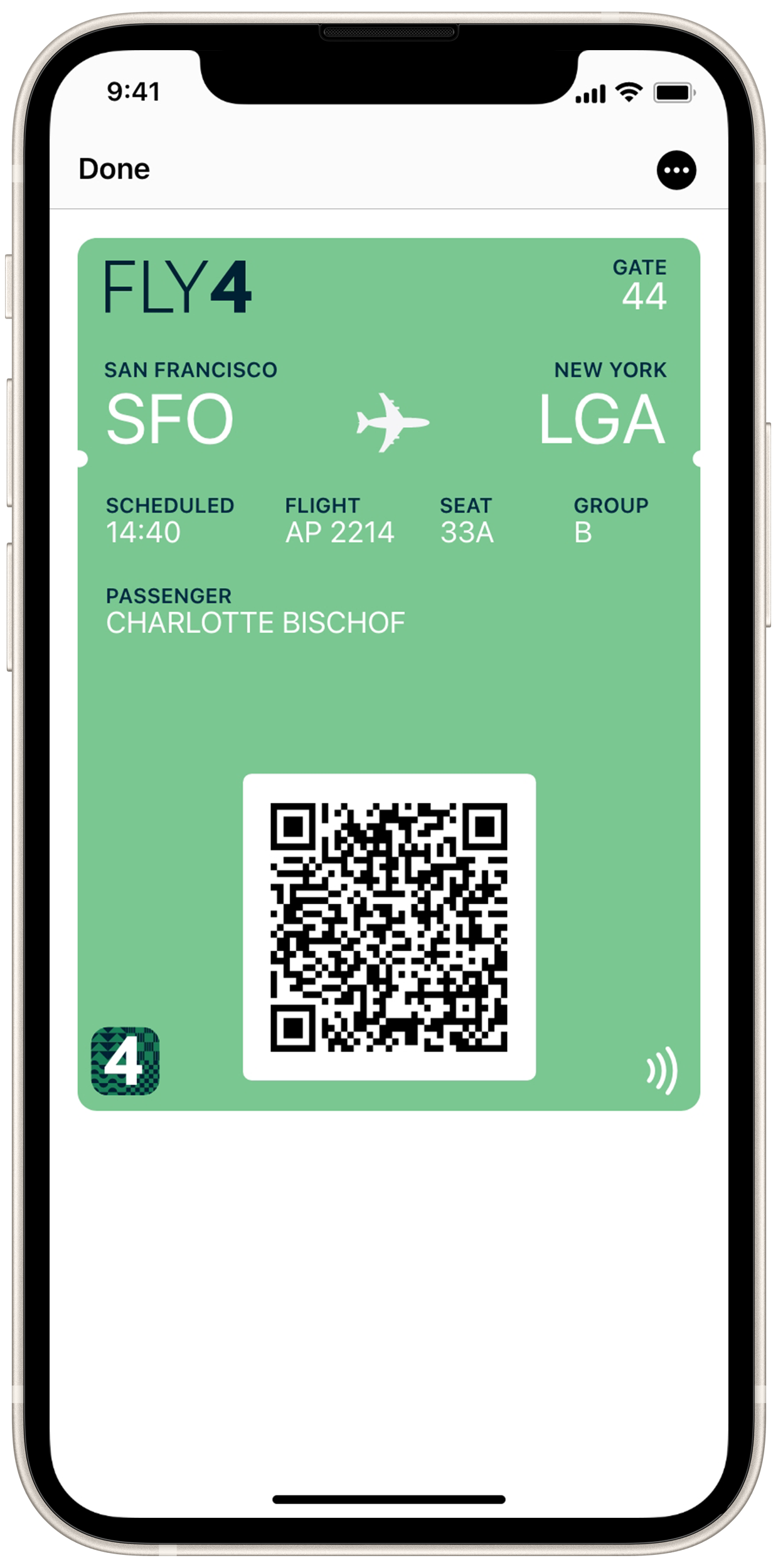
Focusing on a customer centric airline, Fly 4 is inspired by the four forces of flight - thrust, drag, lift and weight. Straying from the typical reds and blues of airlines, the rich blues and greens were chosen to represent the class of those flying with Fly 4. In addition to conveying the clientele of the brand, blue is one of the most soothing colors, utilized to calm those who may have a fear of flying. The patterns depicted throughout the posters and other elements are topographical depictions of mountains, fields, towns, and water - as you would see from a Fly 4 plane, and as seen on our livery.
Research
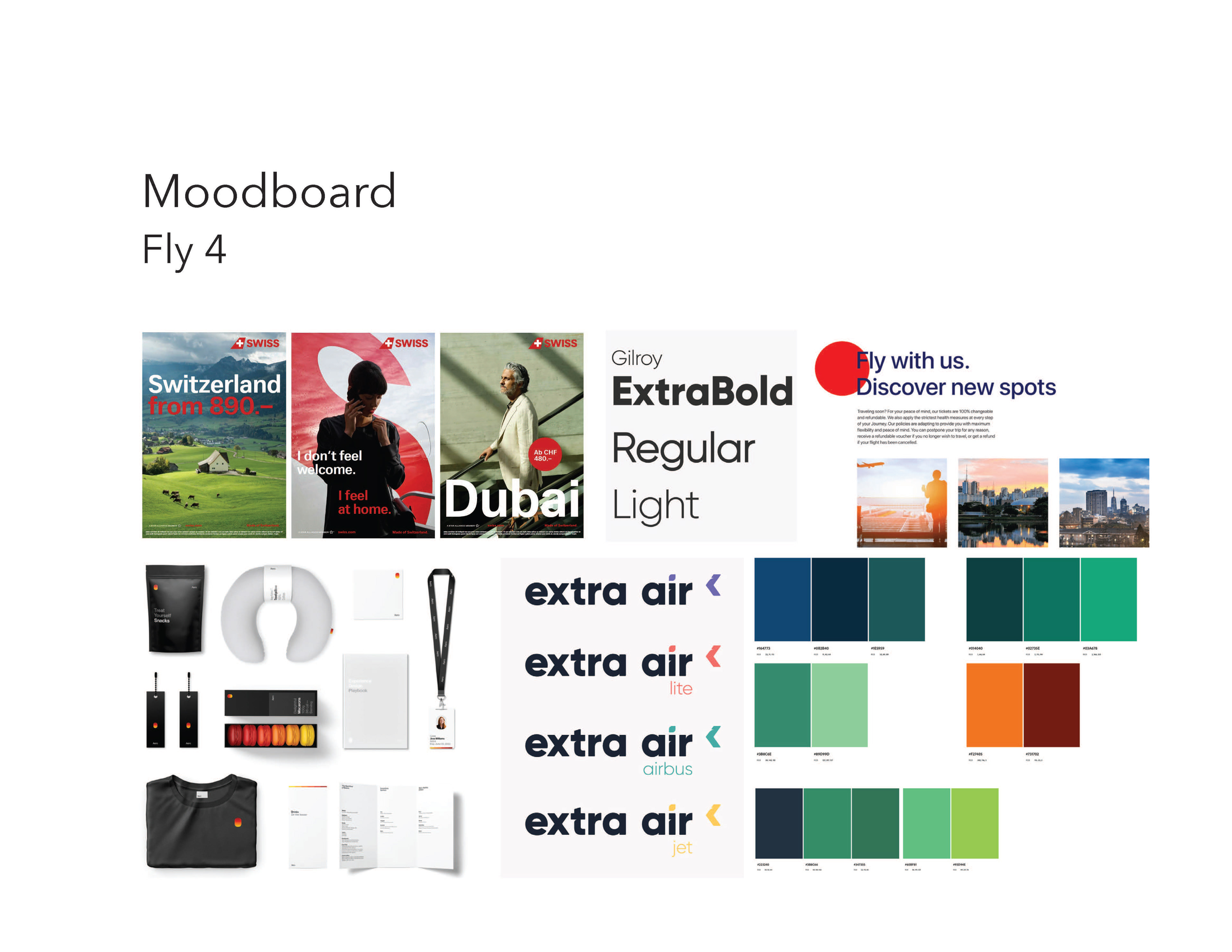
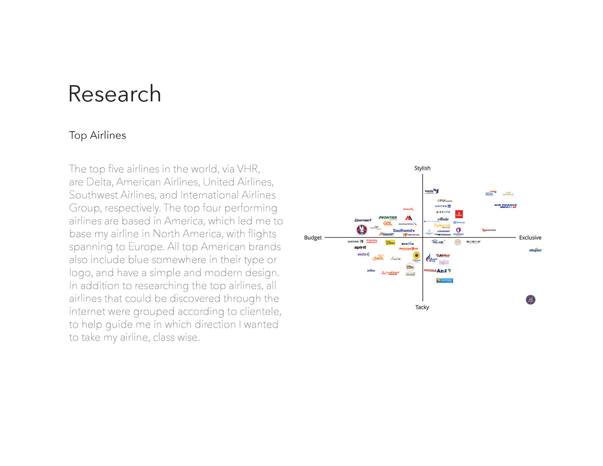
Beginning with an expansive search of the most popular existing airlines by country, they were separated into four different groups based off several factors, including price, clientele, branding, etc. After dividing the airlines, I created a mood board and collected existing airline branding deliverables and posters.
Sketches
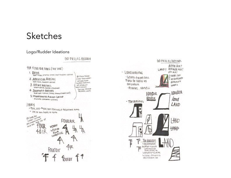
When I began my sketches, I had absolutely no idea what name I wanted to use and no solid concept behind it. With time, and patience, I came up with Fly 4, an homage to the four forces of flight, as well as a play on "flying for" various airline reasons. A couple of different campaigns I developed were Fly 4 Business, Fly 4 Exploration, and Fly 4 Holiday.
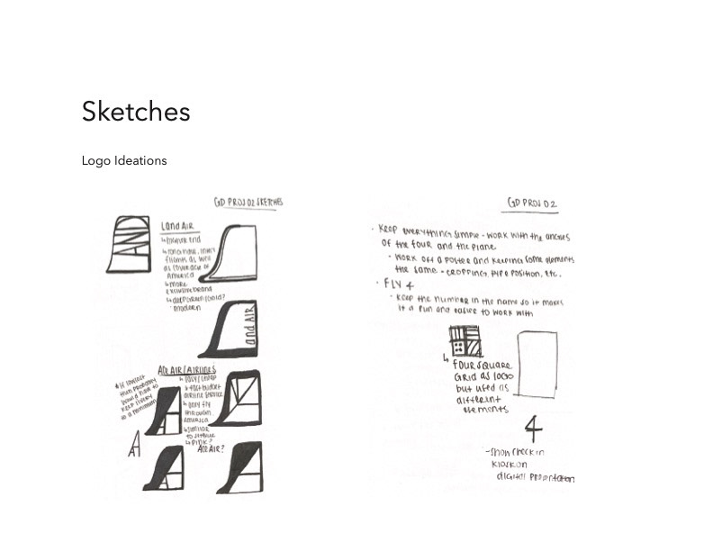
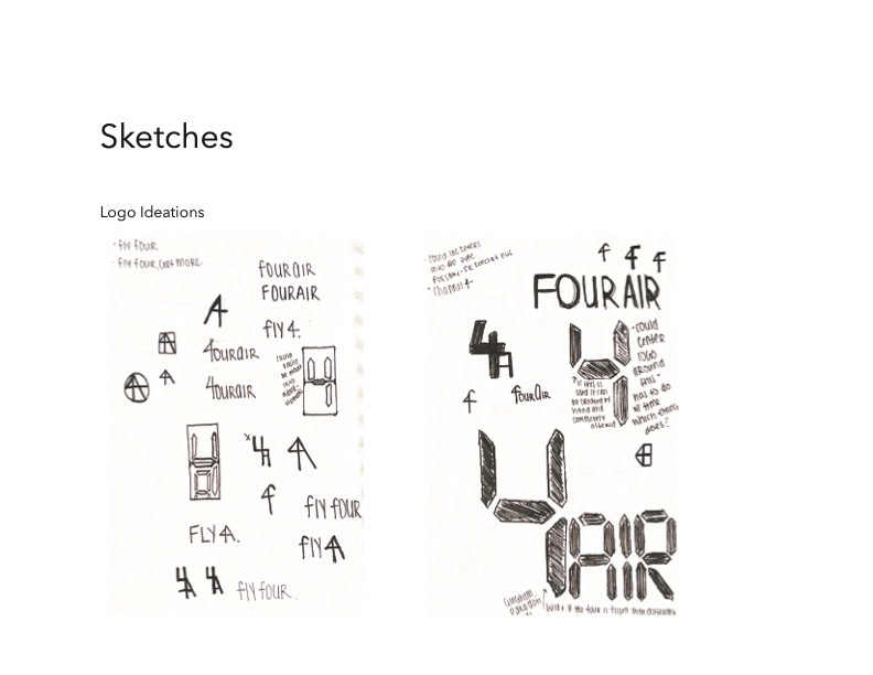
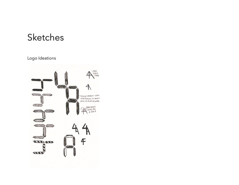
Logo Process
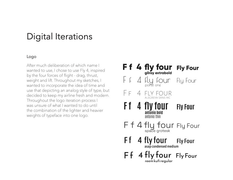
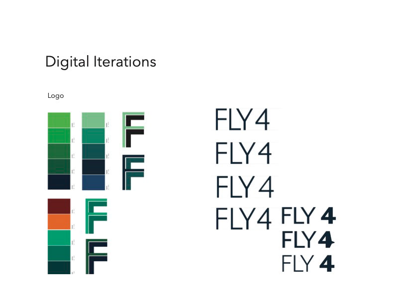
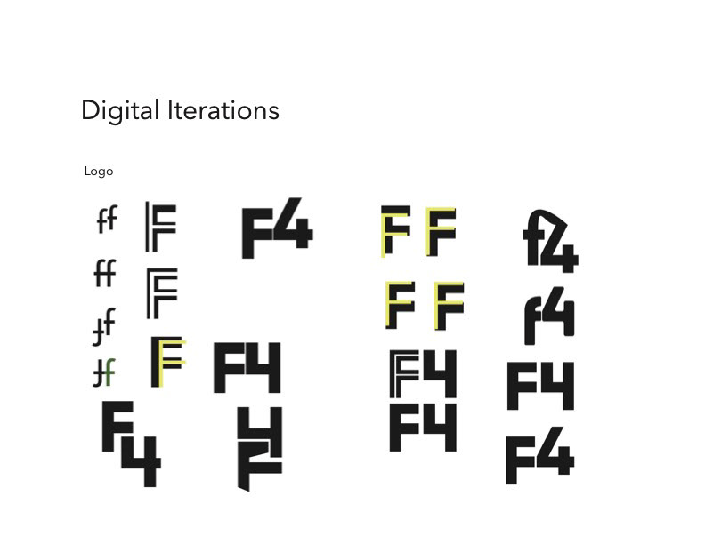
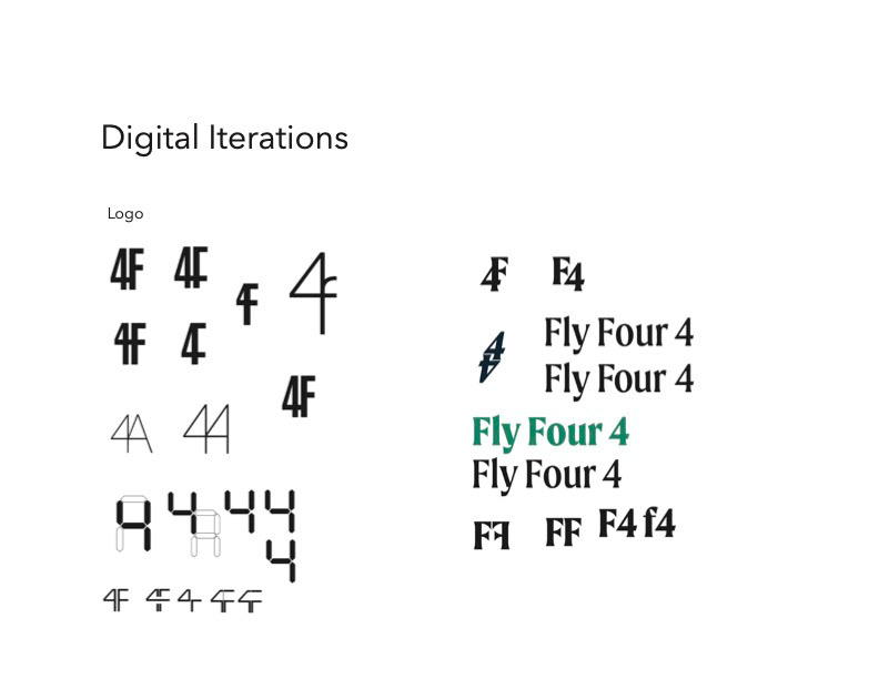
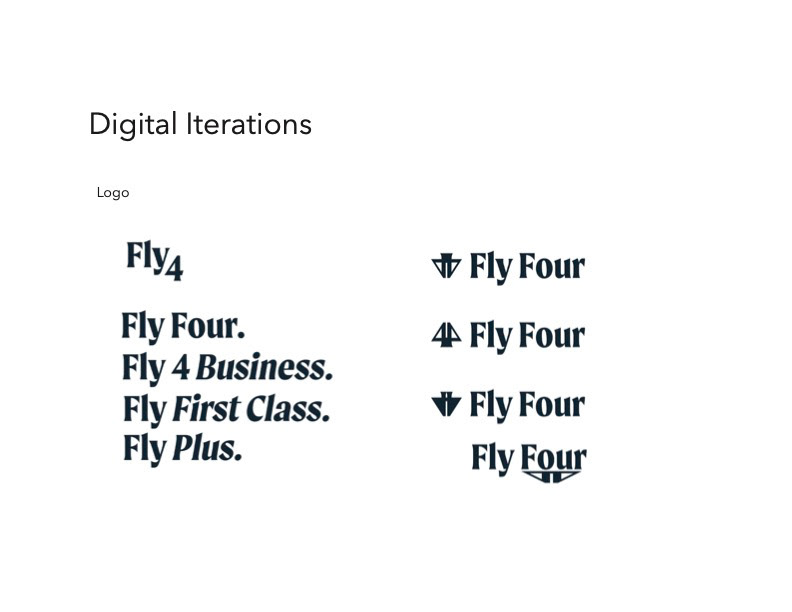
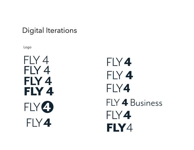
After settling on my name and airline feel, I moved to logo design and experimentations. As I was designing the logo, I was working on different elements of the project, including the poster and boarding pass.
Poster Process
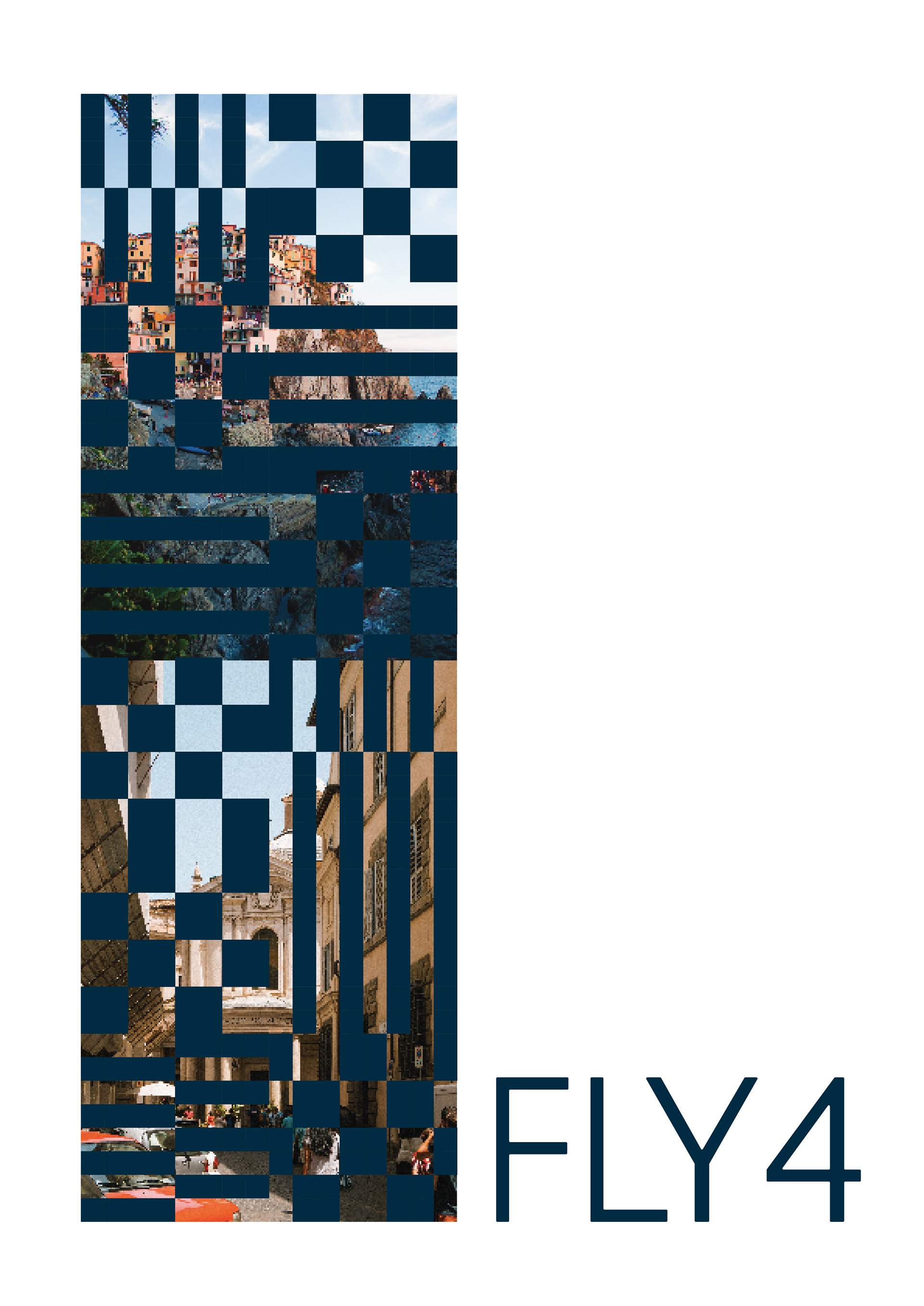
Beginning similar to the logo process with little direction, I began thinking of repetition through different travel destinations, and later imagery of travel destinations. After discovering this wasn't working, I pivoted to inspiration from topography, and from there developed the patterns utilized throughout my project.
