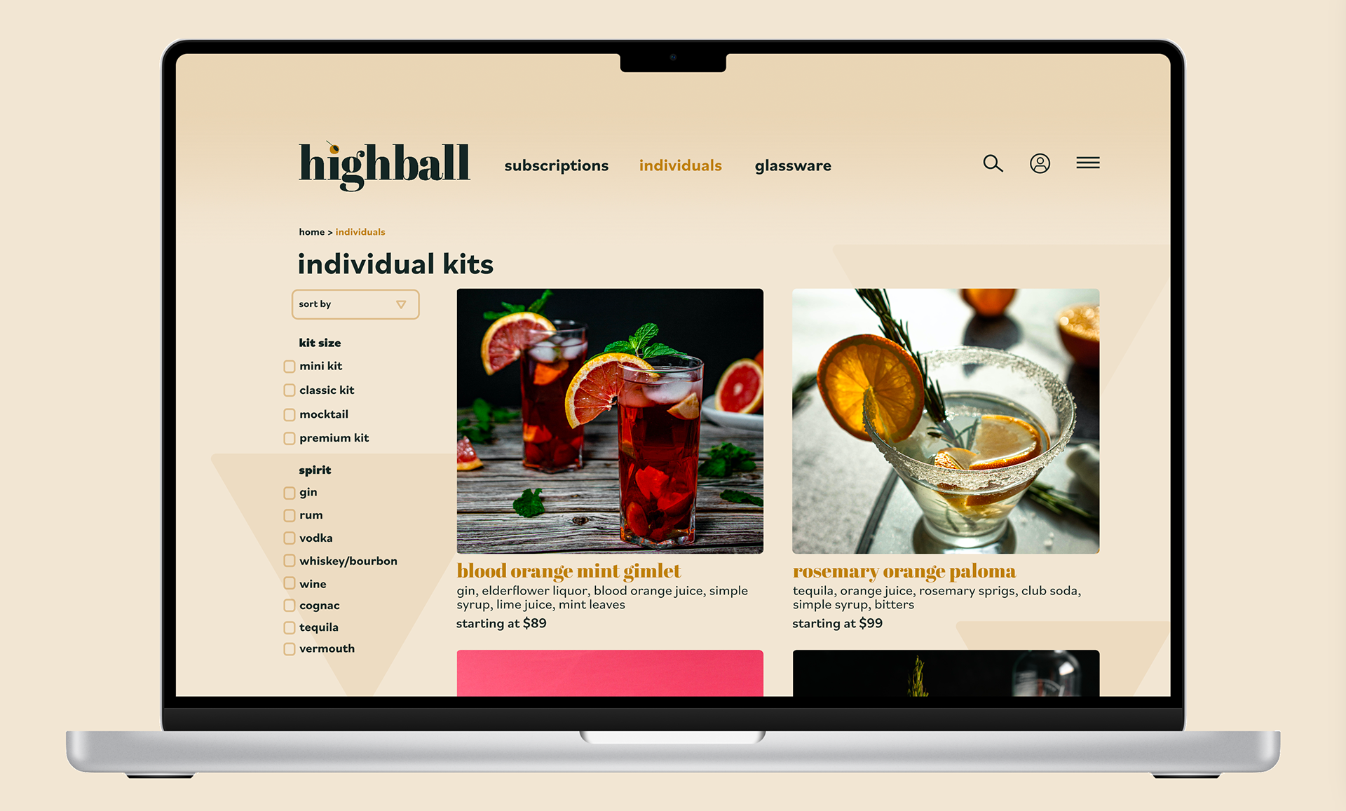
Tasked with creating a completely opened ended brand, I was inspired to create Highball, a customizable online-only cocktail subscription aimed at educating the next generation of at-home bartenders. Customers are able to pick delivery frequency, cocktail profiles, and liquor included (or omitted).
Below is my process work and final designs for this project.
Final Designs
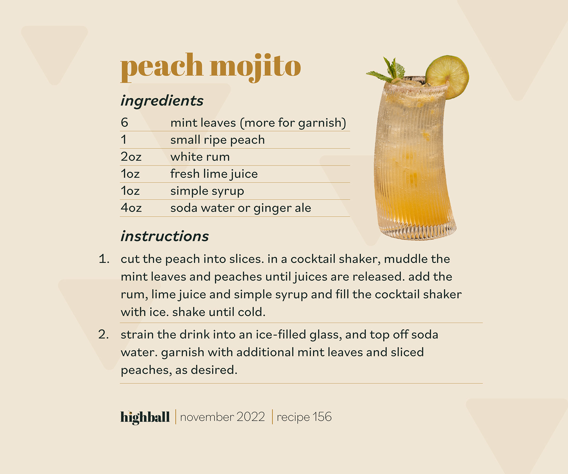
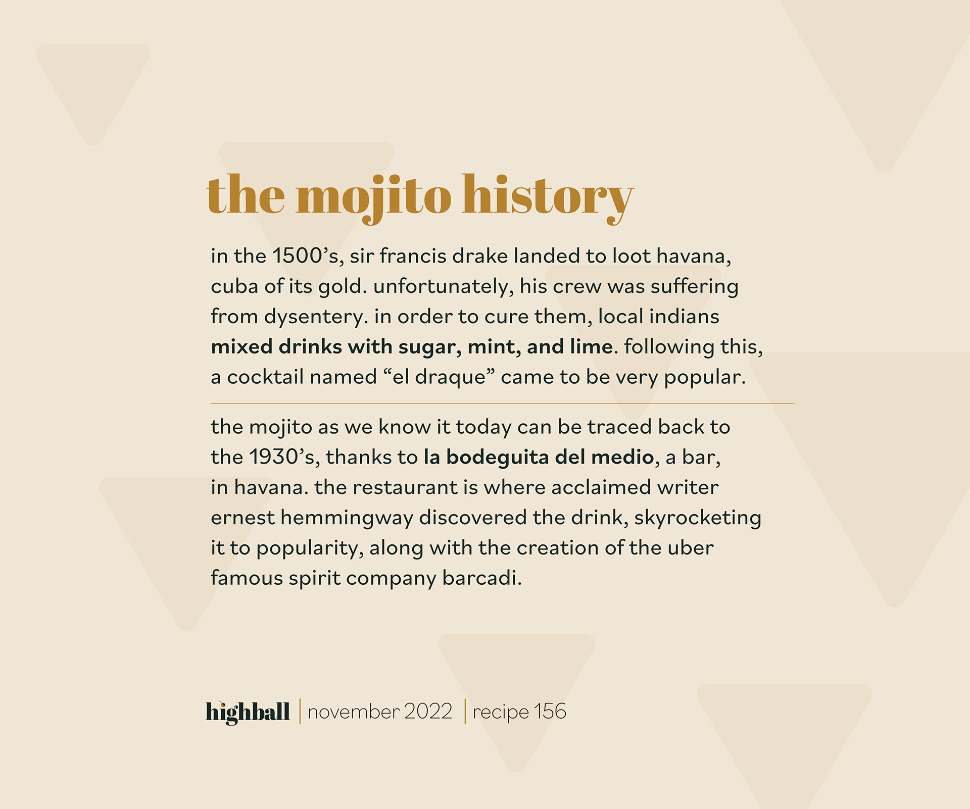
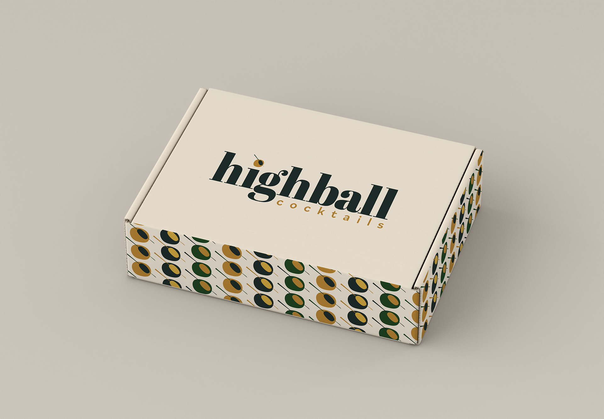
With the mission of creating the next generation of at-home bartenders in mind, Highball was targeted towards women in their mid twenties–late thirties. Understated colors mimic the namesake cocktail, the Whiskey Highball. The company has no brick and mortar presence, and operates solely through the website and mobile app, with social media ads targeted towards users. In addition to all web assets, product mockups were created.
Research
Competitive analysis revealed that several cocktail subscriptions already on the market were extremely similar, with nothing differentiating them. The hallmark of Highball would be empowering the next generation of at home bartenders, and providing them with materials such as recipe cards, blog posts, and social media tips to ensure their success.
Logo Process
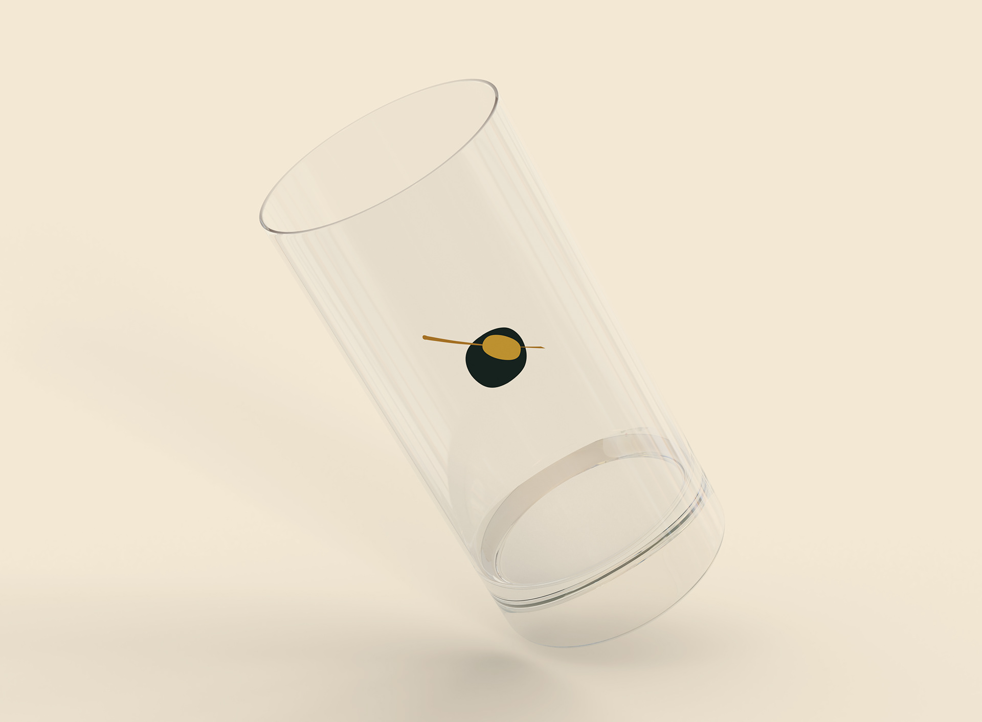
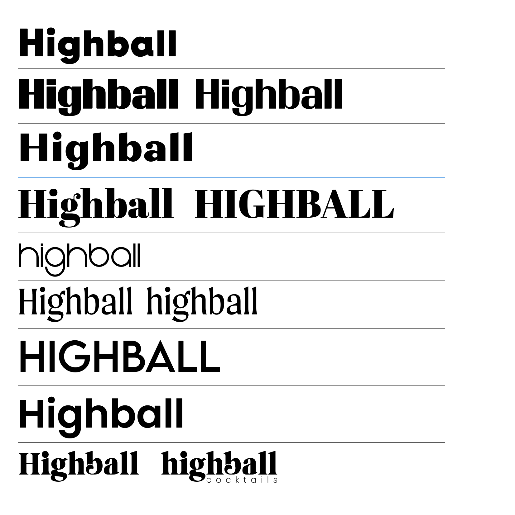
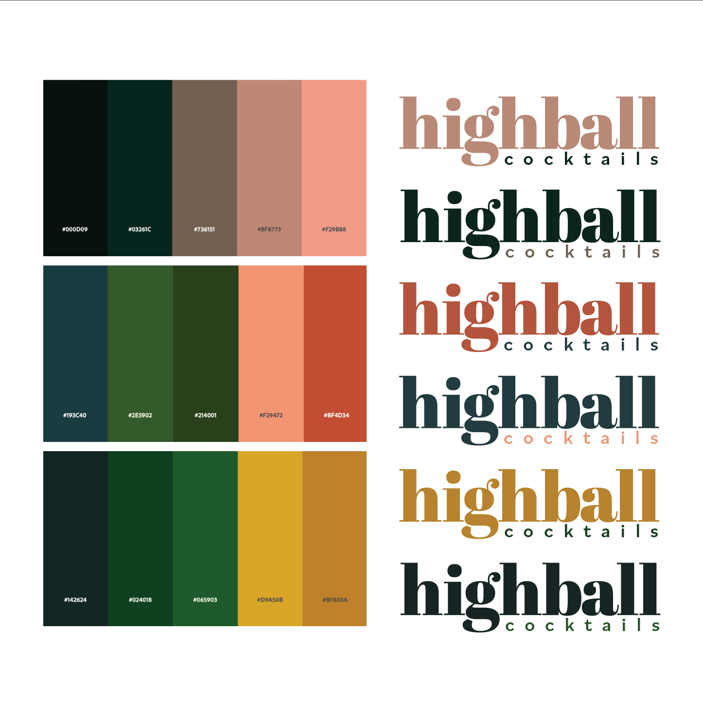
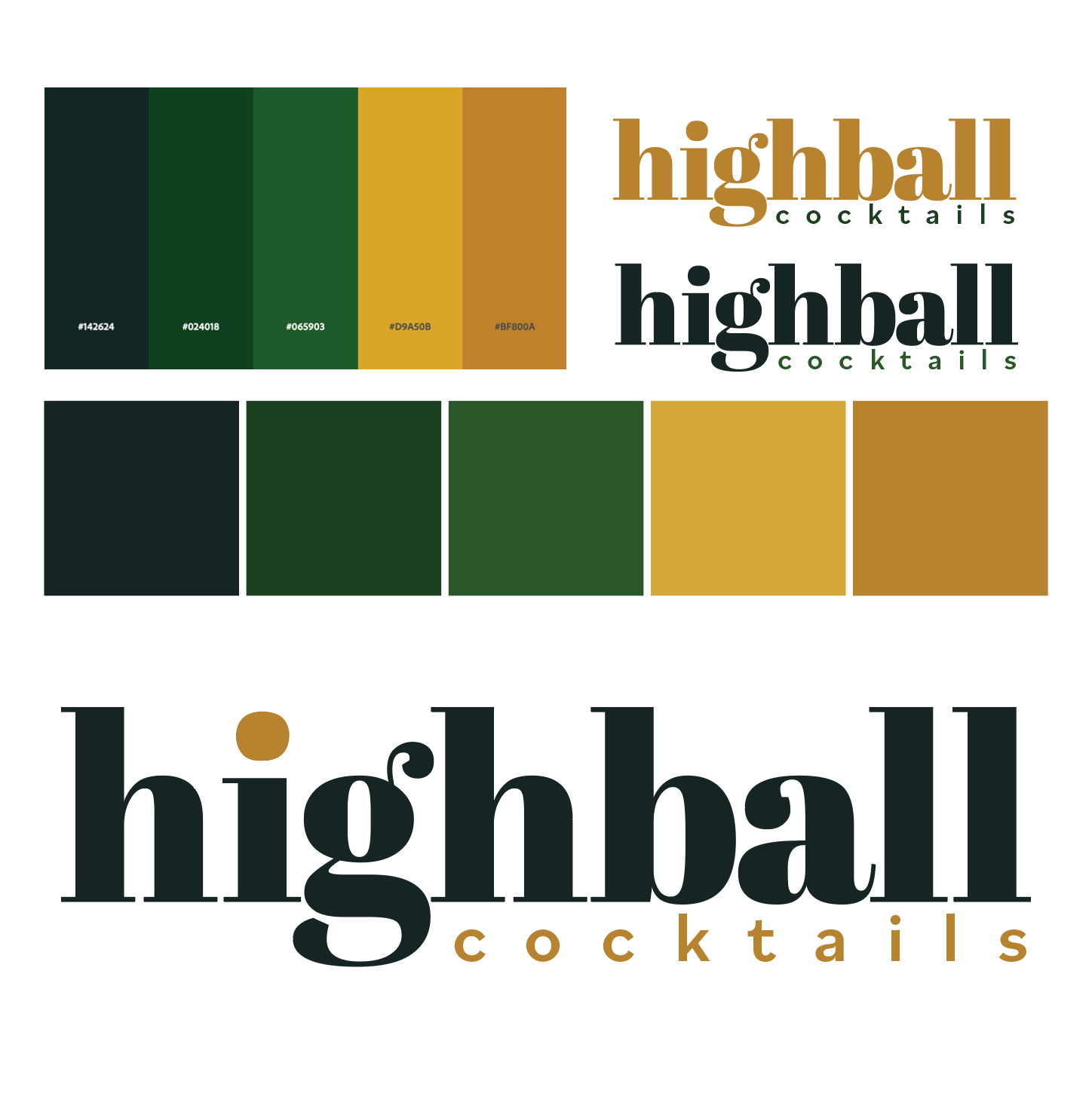
When I began my ideations, I had definitively chosen the name Highball, and was starting to experiment with the wordmark and logo. As I began to experiment with the wordmark, the olive that came to follow as a variation of logo came to be used for several different graphic elements, such as the signature and packaging graphics.




Instagram Stories Process
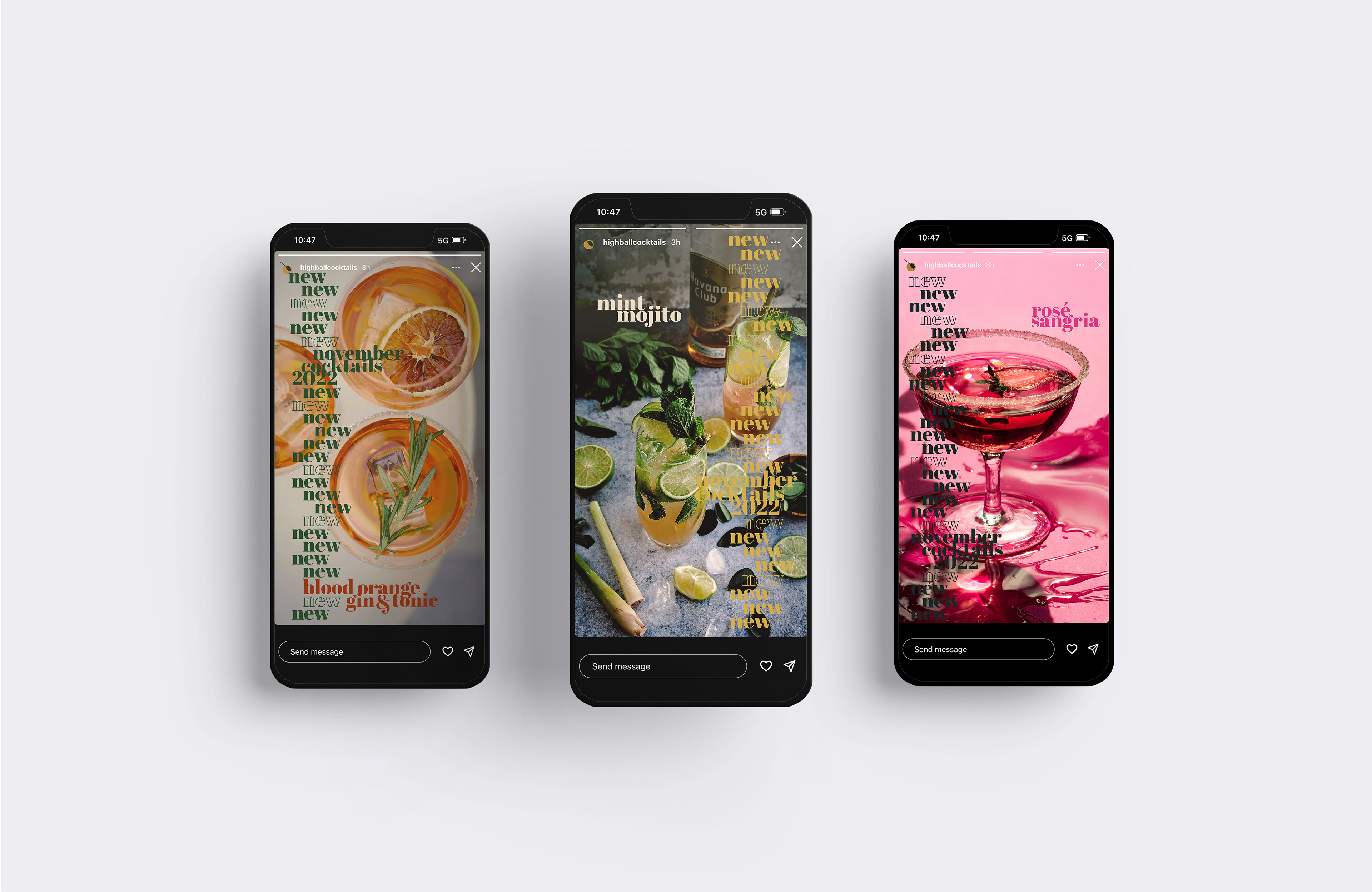
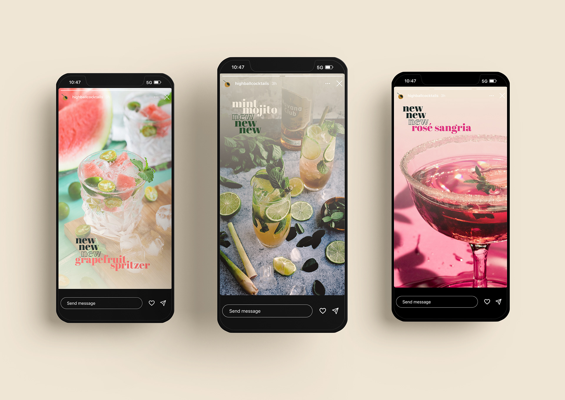
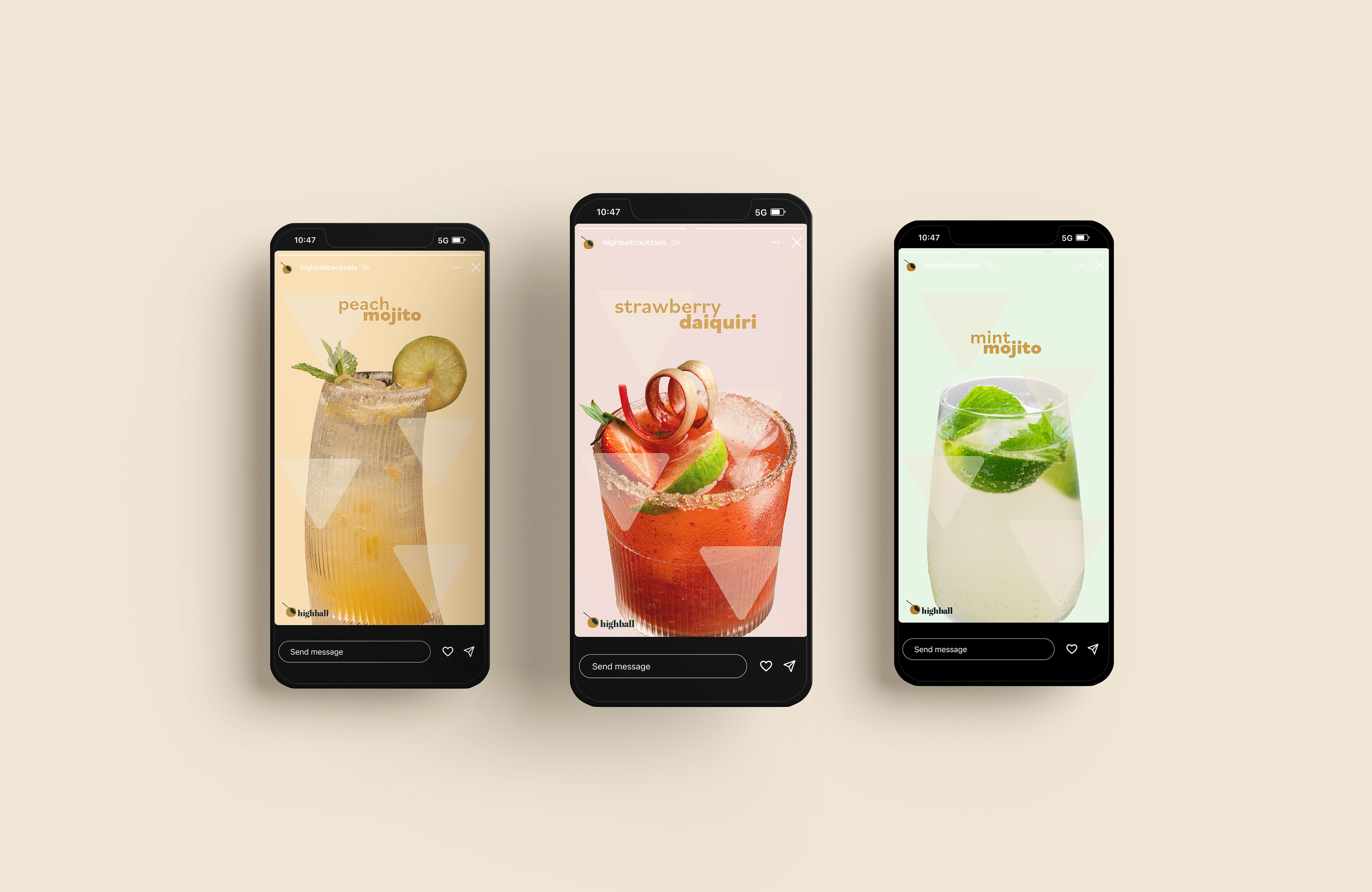
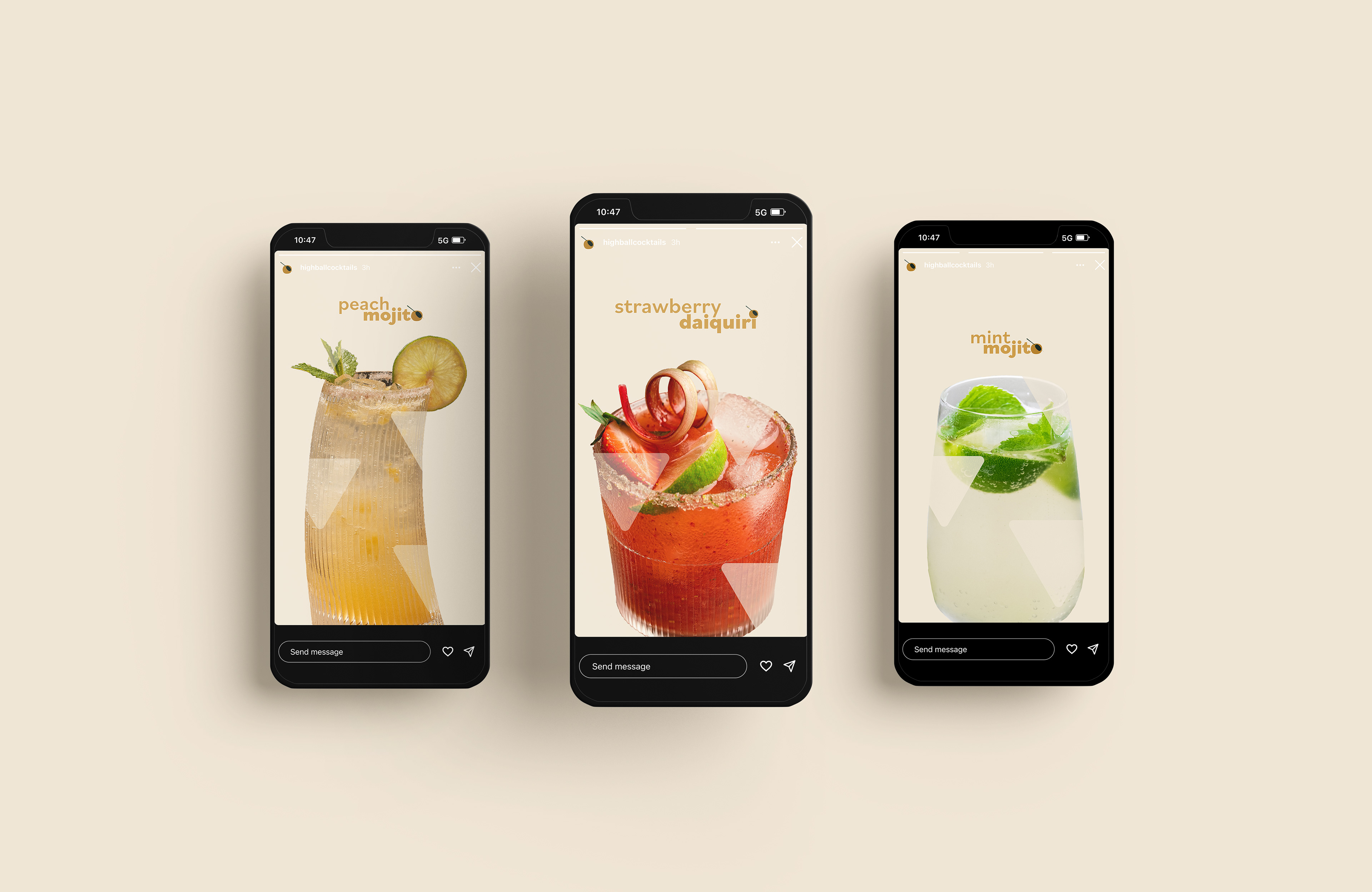
The first thing I chose to design was the triad of Instagram stories. Beginning, I wanted bright and fun colors to pop and attract people to read them, and quickly realized the type was illegible, and it held no brand elements of Highball. Throughout the curation of these stories, hand in hand with the web assets, the brand of Highball came to fruition.
I
II
III
IV
Website Process
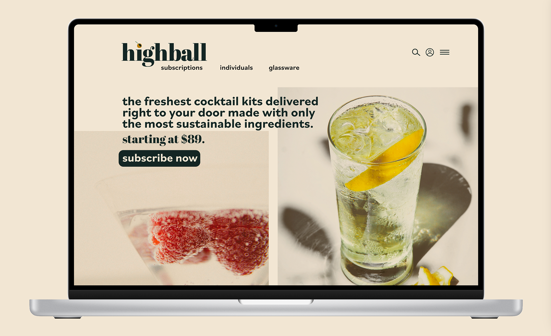
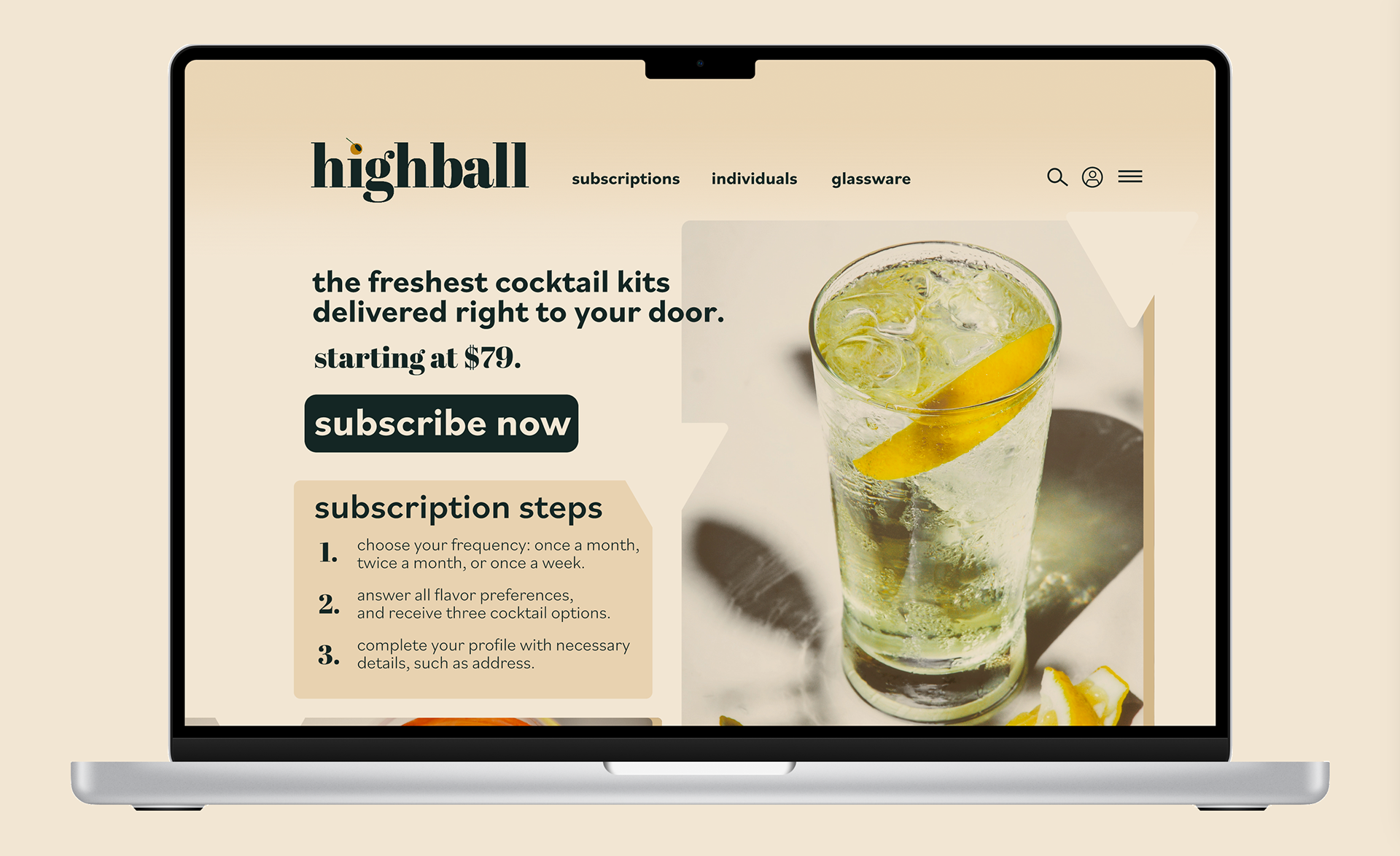
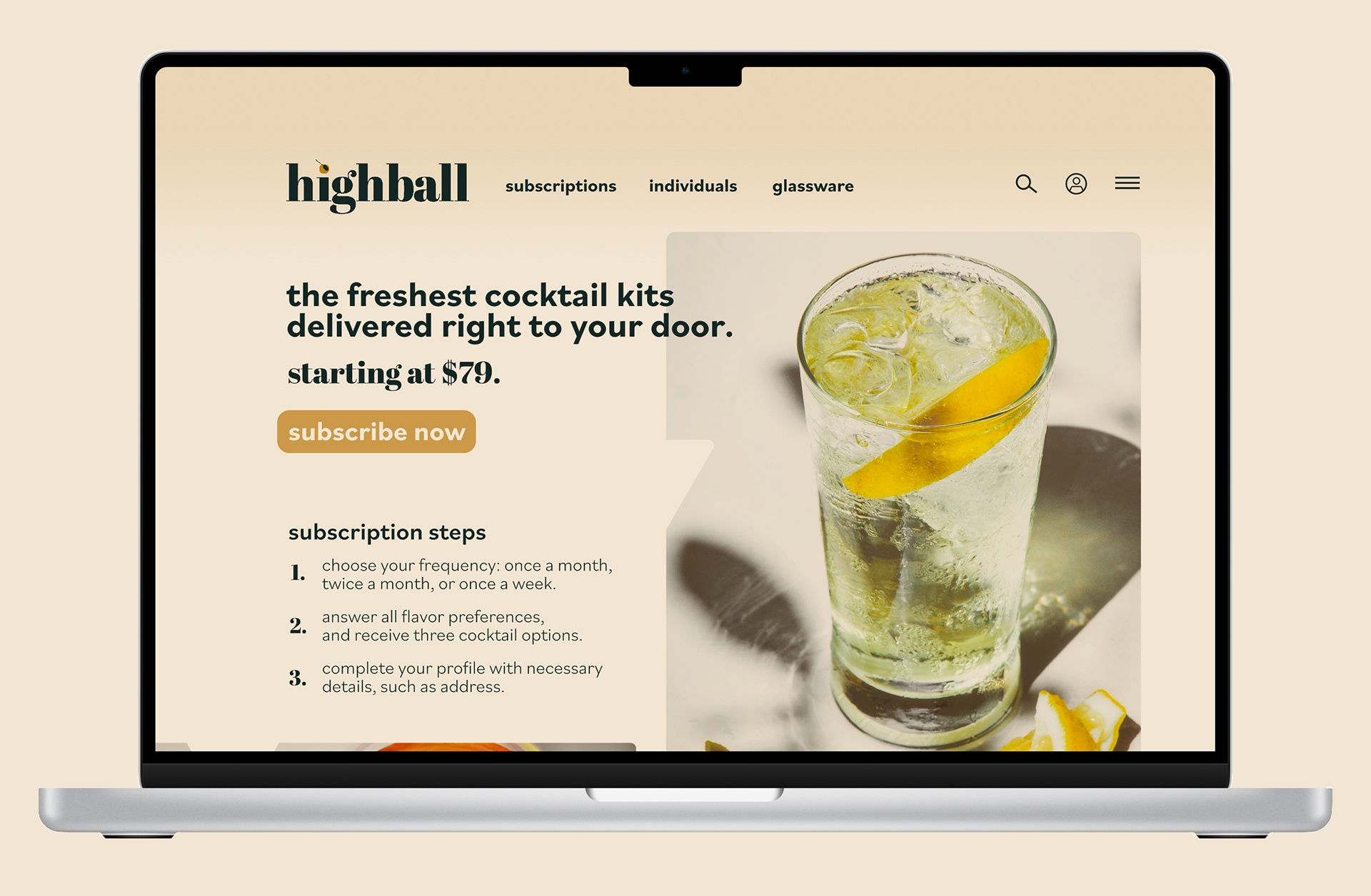
In conjunction with the creation of social media posts, creating the sole front of the business was where the brand elements were created. The colors mimicked a Highball cocktail, with various shades in play. The imagery was clean and classic, showing consumers what their cocktail kits would look like.
I
II

III
IV
