Leddy Park Zoo is a sustainability focused zoo with a variety of programs to promote this mission, including rainwater collection programs, organic food, and the elimination of plastics throughout the zoo. Through an entire year of research and design exploration came Leddy Park Zoo, pictured below.
Final Designs
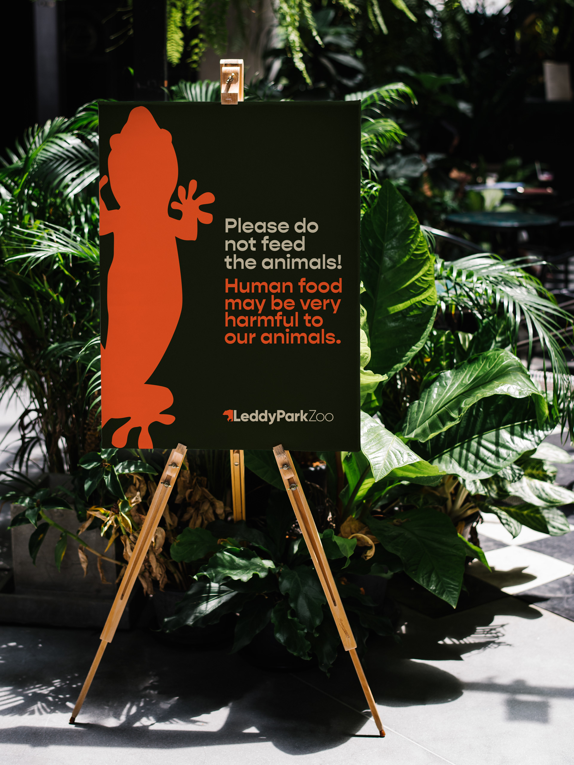
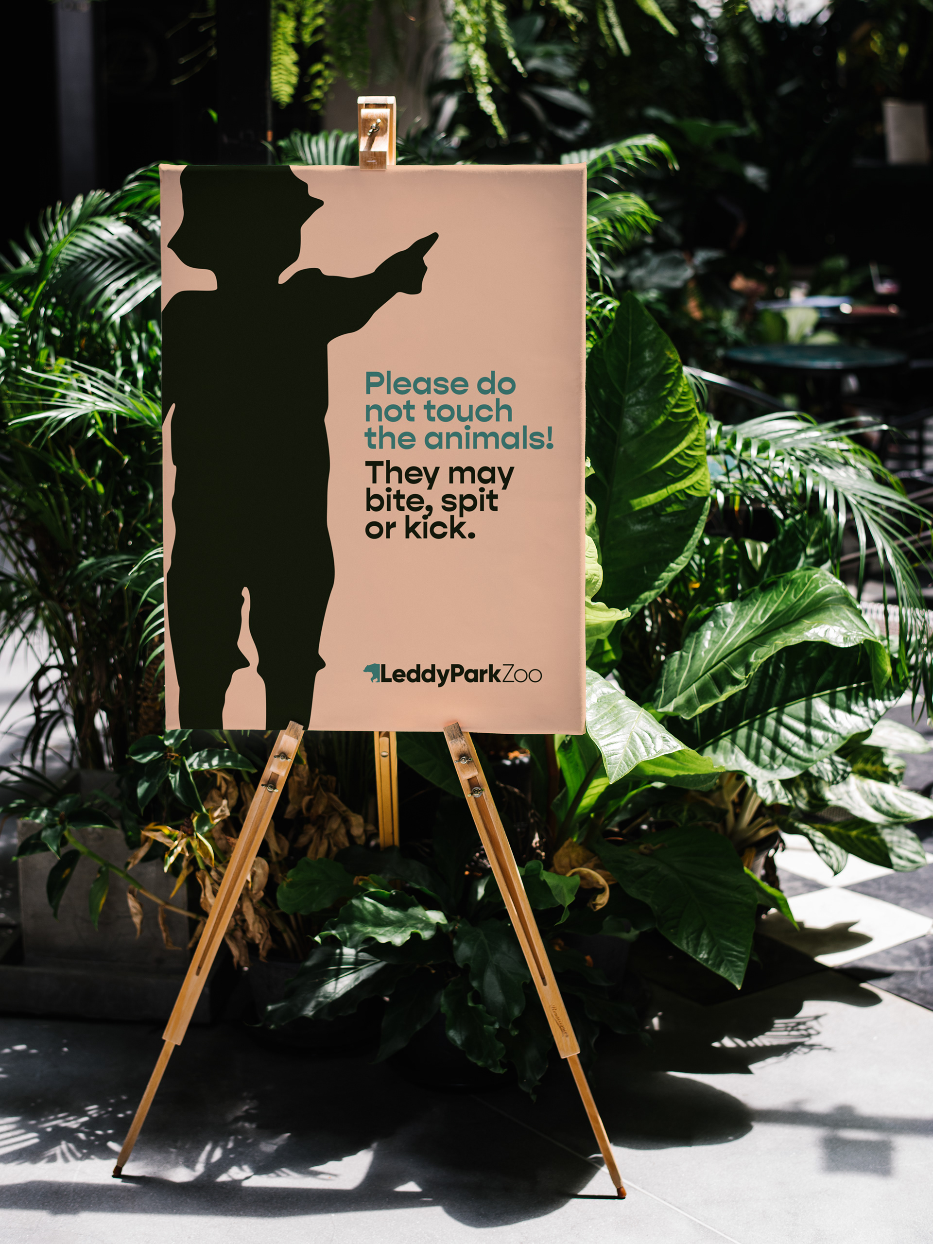
With the mission of preserving sustainability whilst providing the highest standard of care to our animals, Leddy Park Zoo was created in the already-existing Leddy Park, a seven minute walk from downtown Burlington. Due to the nature of zoos as well as its location, the target audiences for LPZ are tourists, and families with children. Below are the final designs for LPZ, including banners, in zoo directional signage, stickers, and a web and mobile site.
Research & Logo Process
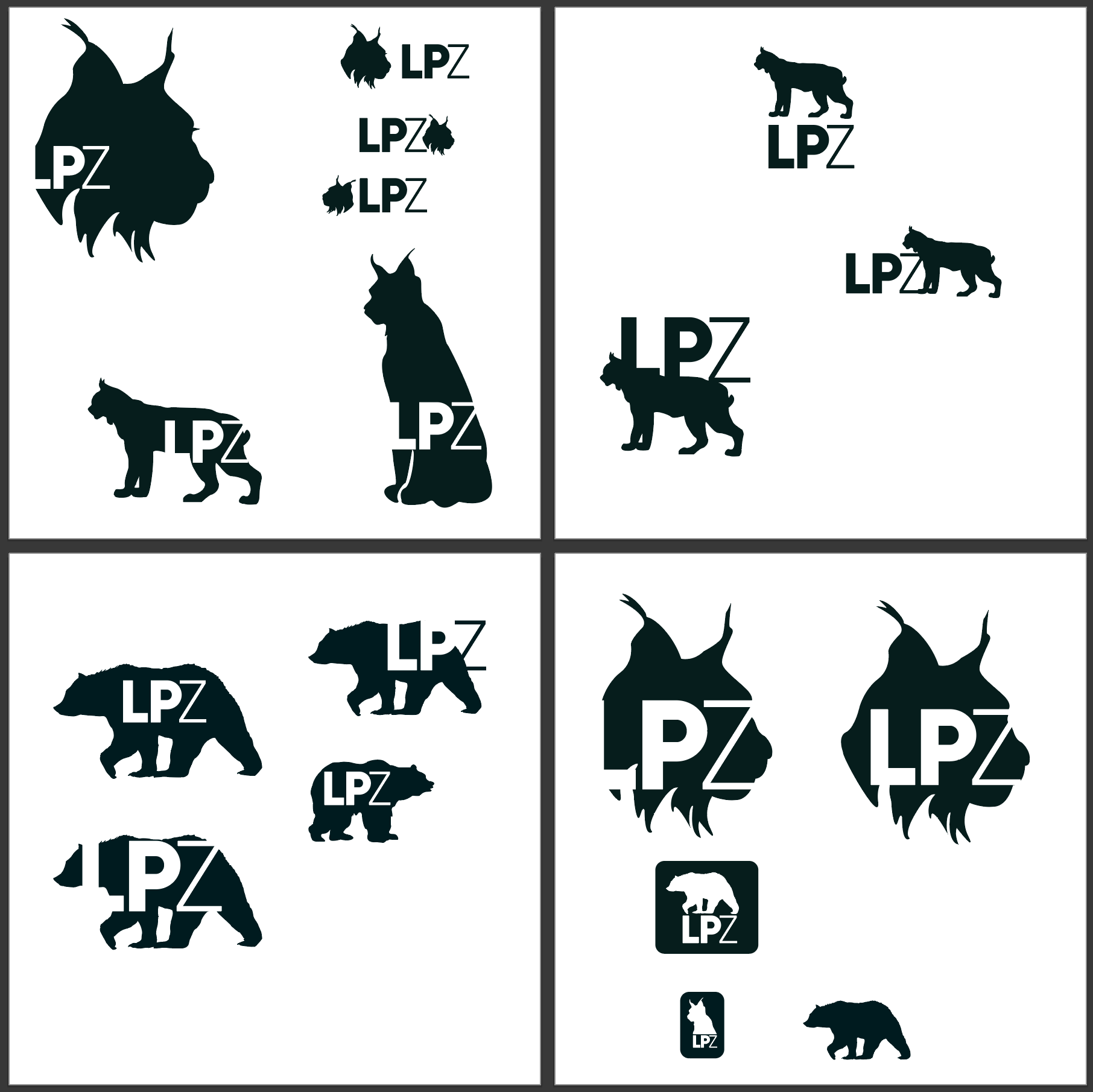
I have been fortunate enough to travel to zoos around the globe, and in my travels, coupled with my competitive analysis, it became apparent that although several zoos claim to be extremely sustainable, this is only something that happens through conservation. Zoos do not take into account their sustainability on their campus, which is the primary focus of LPZ.
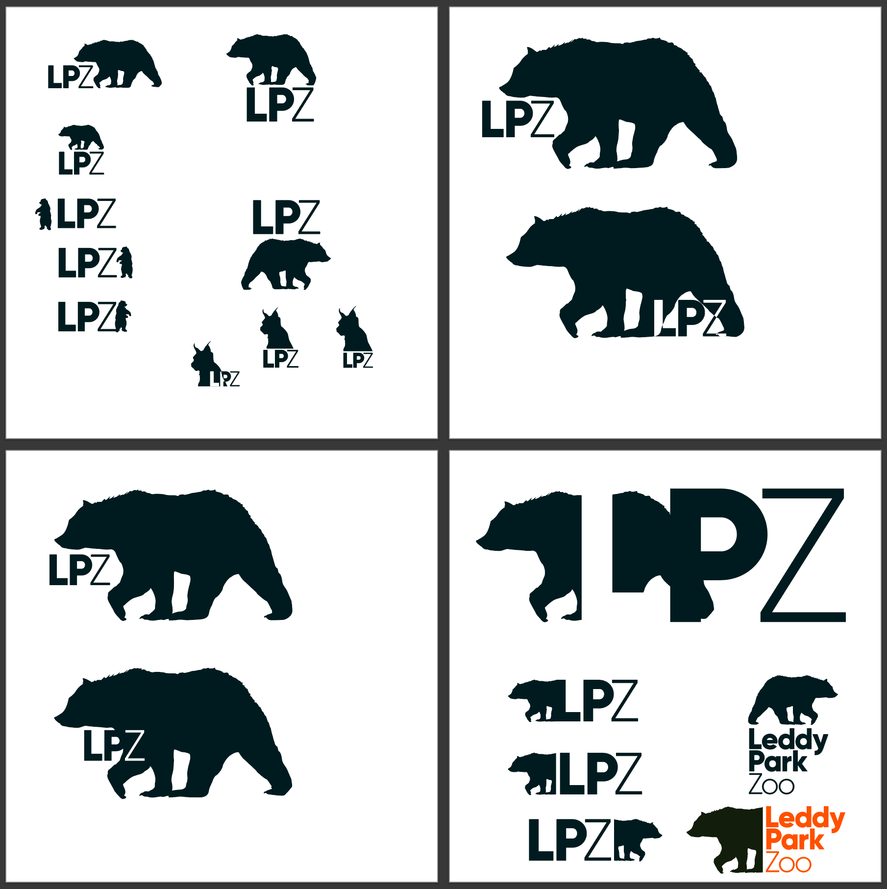
Due to the modern nature of the zoo, I knew I wanted a bold san-serif typeface, and bright, contrasting colors. I have the typical shades of green you always see with a zoo, with some added contrasting colors to really liven it up. After some experimentation with the logo, I landed on a black bear, native to Burlington.
Web & Mobile Site Process
Before beginning any stages of this process, I immediately mapped out the entirety of my web, and mobile site. Through competitive analysis, as well as my research for this project, I was able to determine exactly what pages I needed, and additional pages focused on sustainability to further the LPZ mission. The passion I have for UI/UX definitely shines through on this project, and I spent over half of my time on this project creating the web and mobile sites.
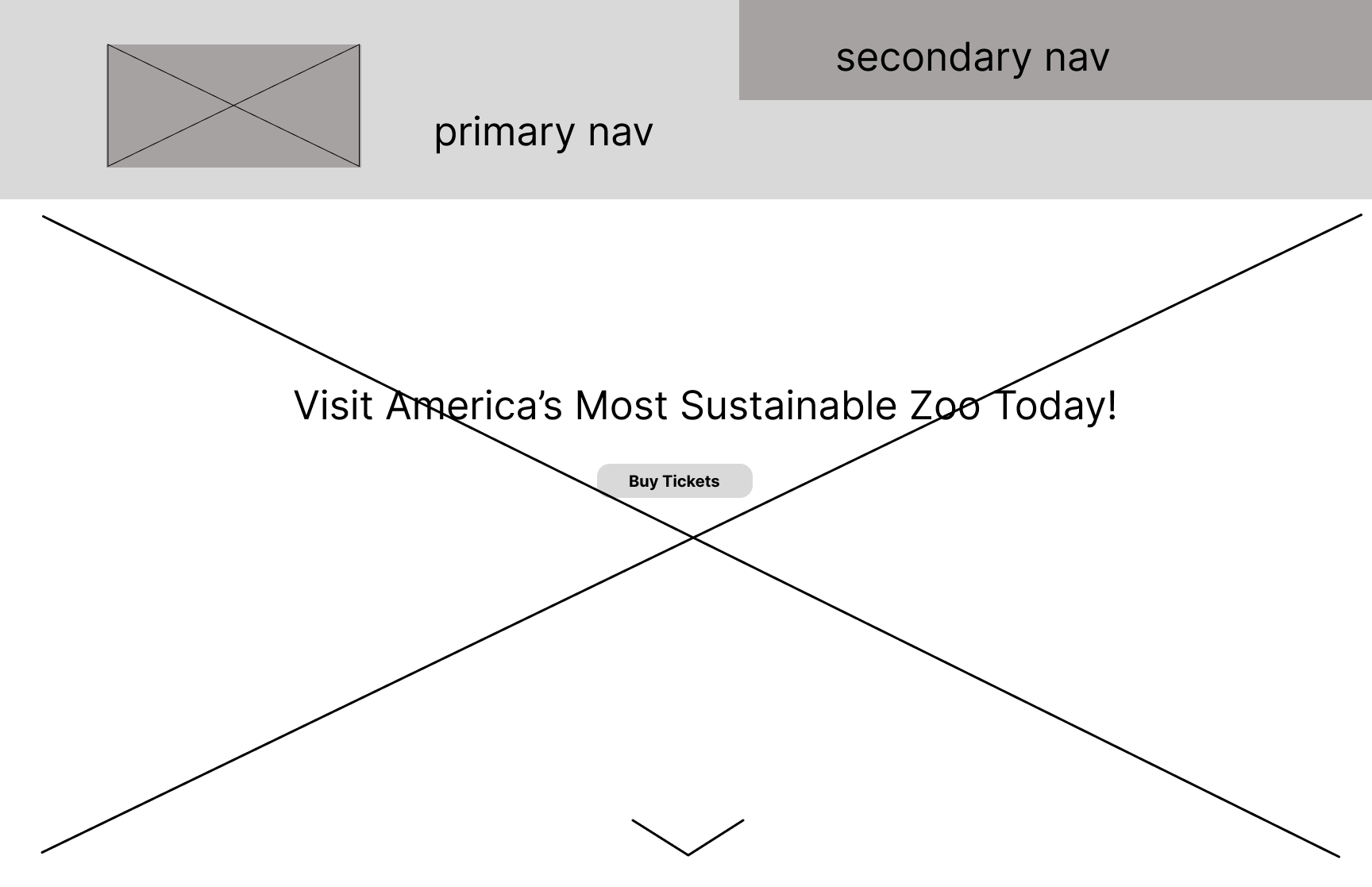
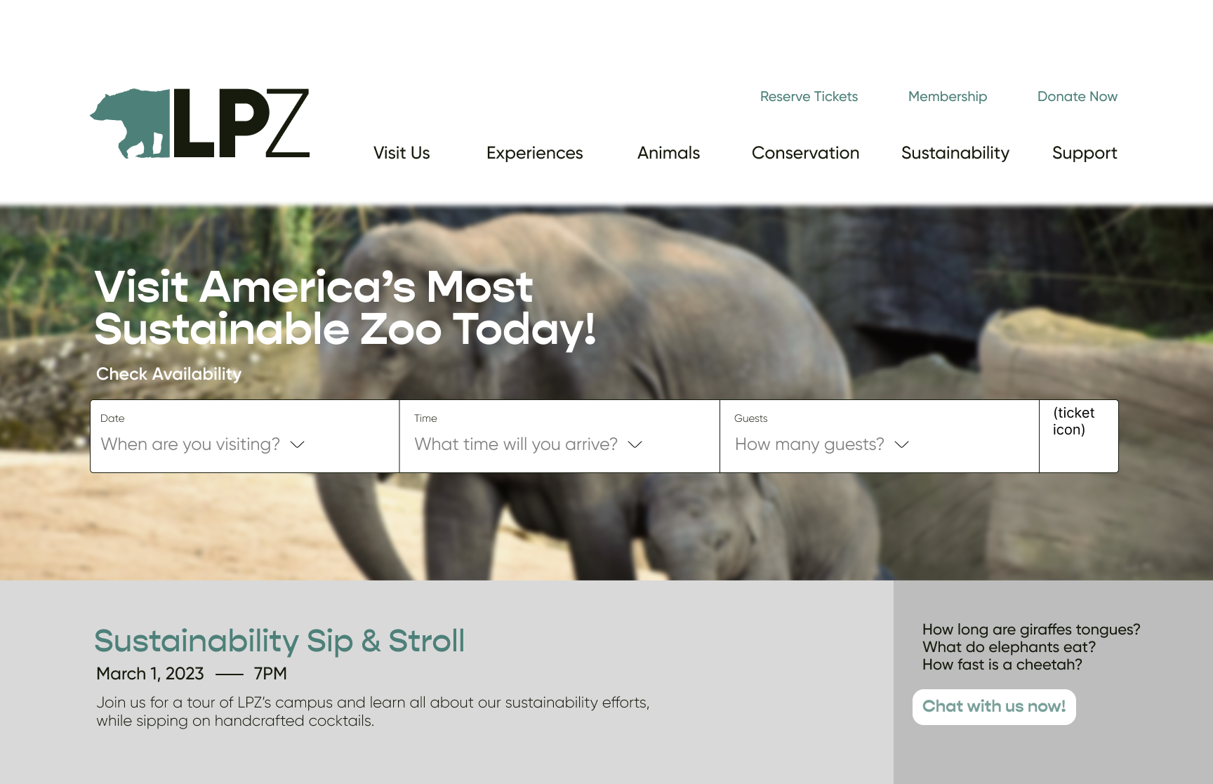
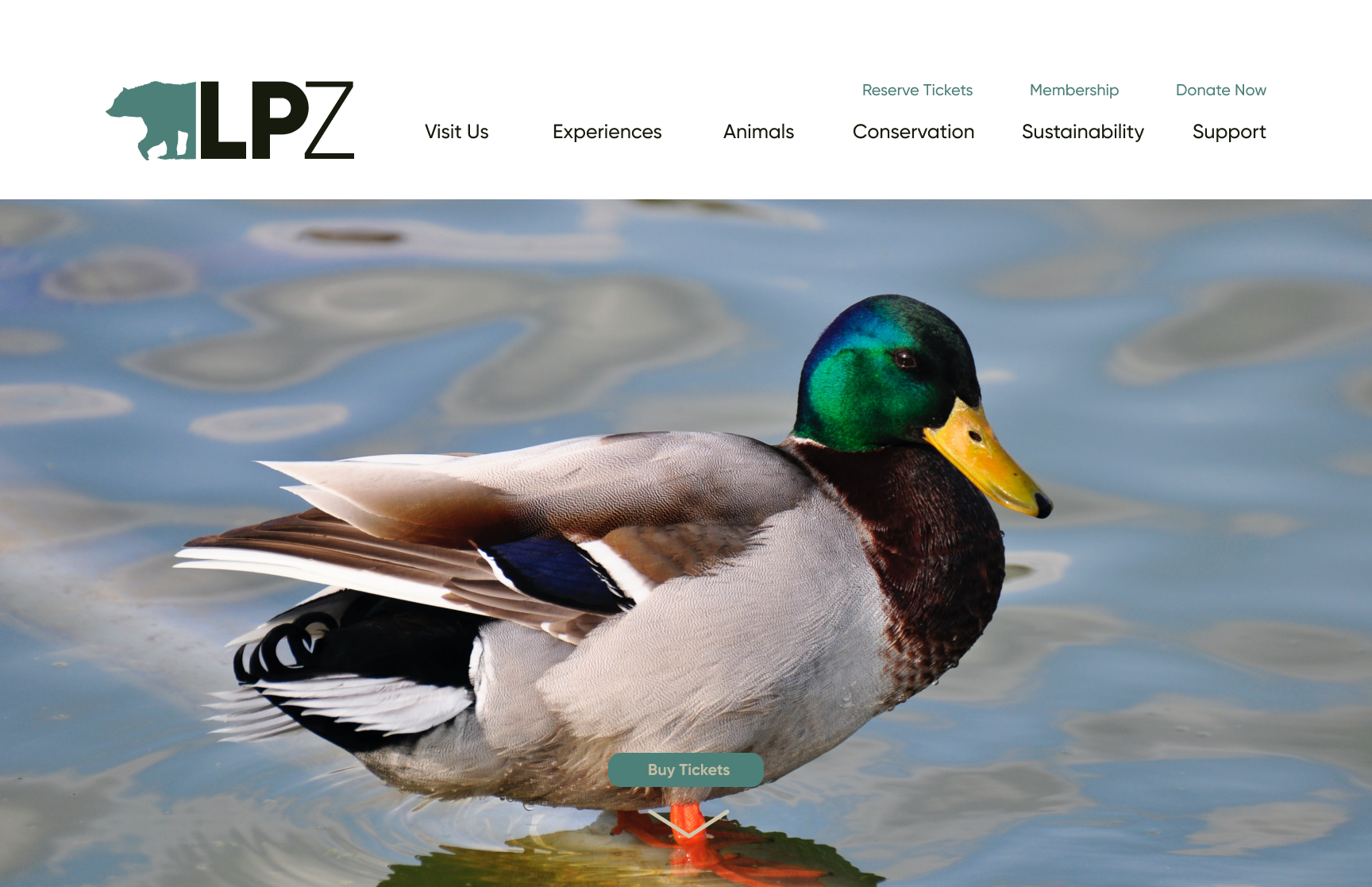
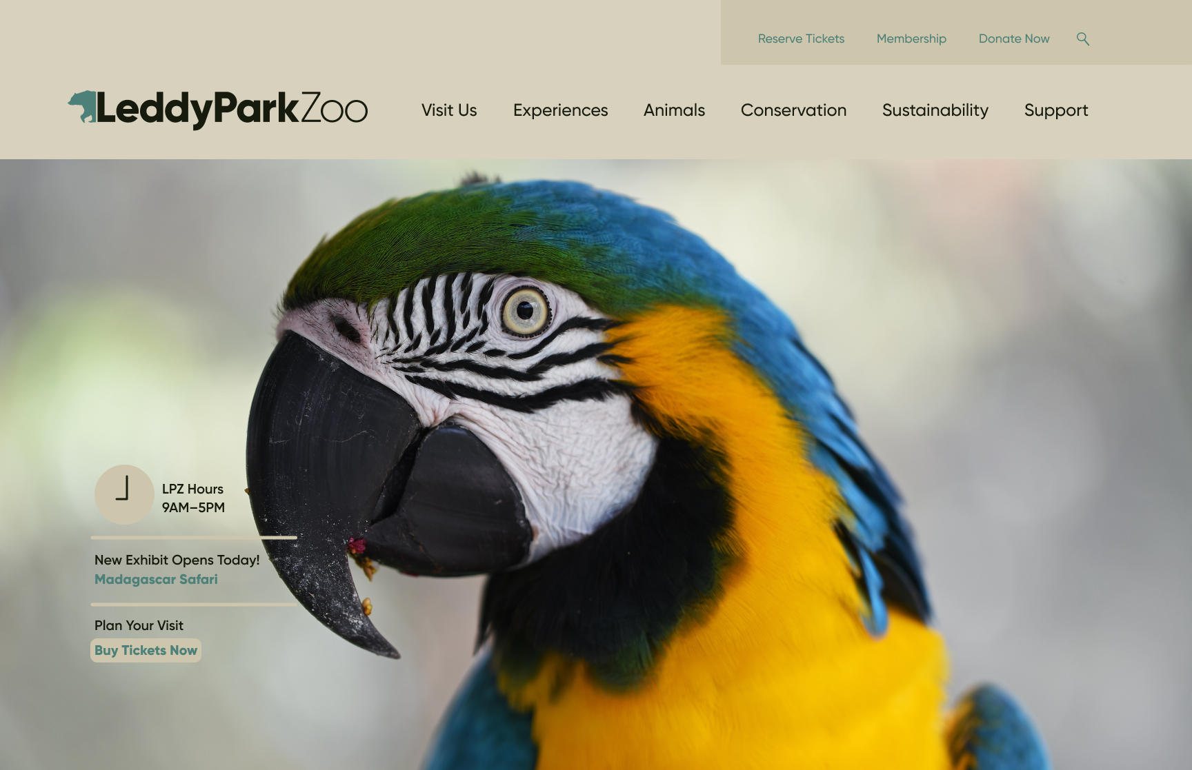
Web and Mobile Site
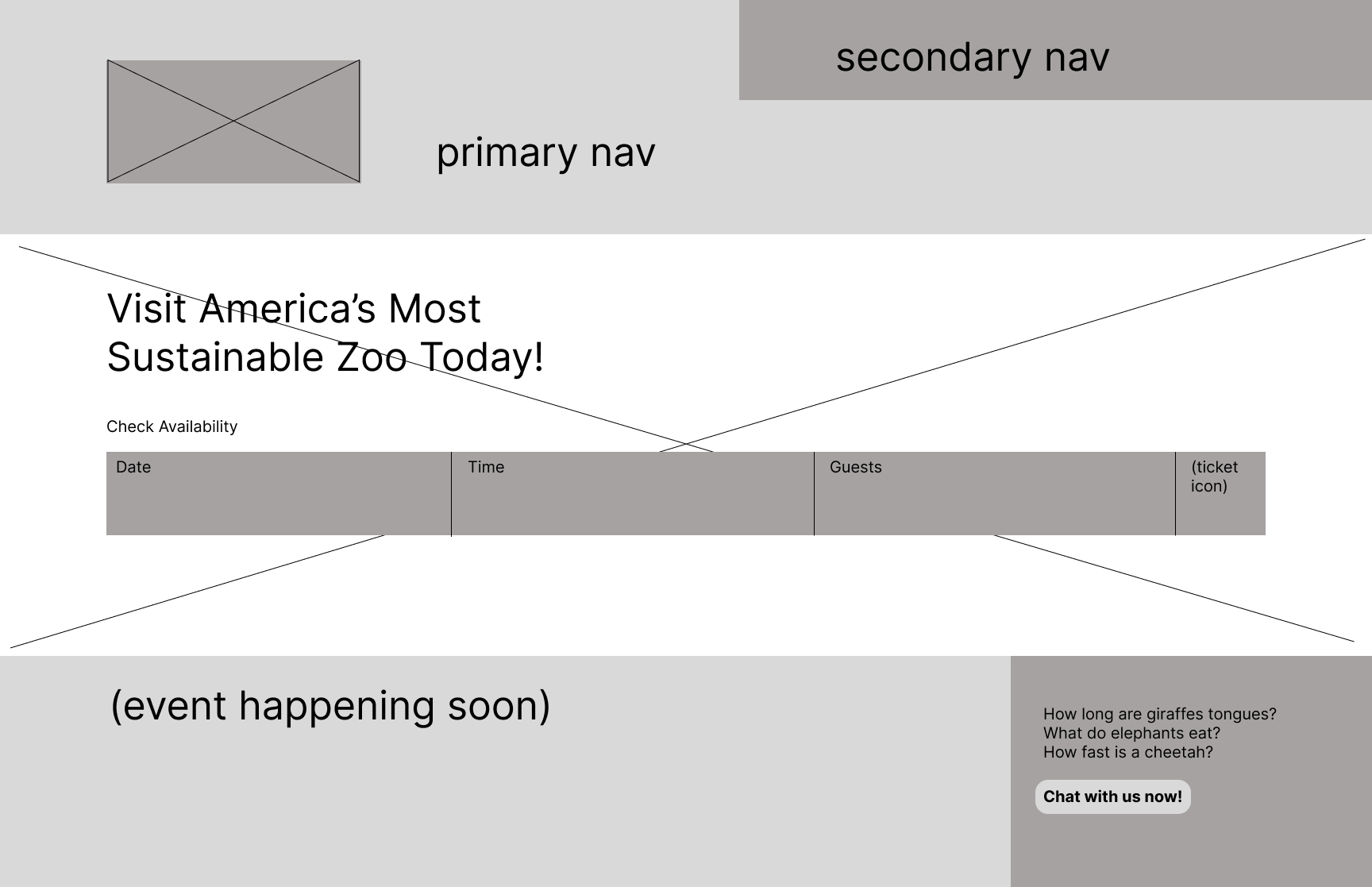
After creating the site map, as well as low & mid fidelity wireframes, I jumped right in. The amount of text throughout the website is cut by imagery, icons, and buttons. Throughout the site, I didn't stray from incorporating the bright, bold colors of LPZ and made sure to highlight them as much as I could. The mobile site is almost a direct translation of the website, with a few things altered for user experience such as larger buttons highlighted with imagery.
