Human trafficking is one of the most lucrative businesses in the world. It is one of the worst violations of human rights around the globe - victims don't have a voice to speak for themselves.
In this project, I was originally tasked with creating twelve Instagram posts about a human rights/social justice campaign. As I continued to progress with this project, I chose to expand it even further into an app, with an App Store page and promotional poster, as well as two infographics. In addition, I designed an information video, a snippet of which can be seen as a gif.
Below is my research, process work, and final designs for all elements of this project.
Gif from a video pertaining to human trafficking statistics, 2021.
Final Mobile Designs
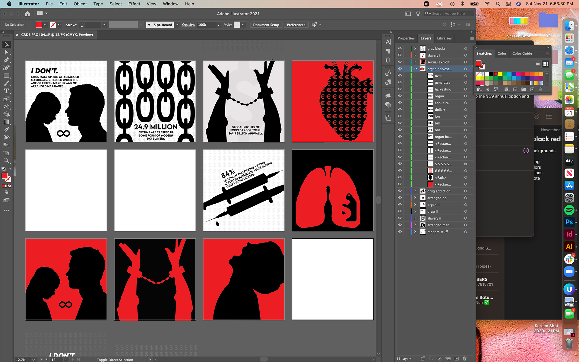
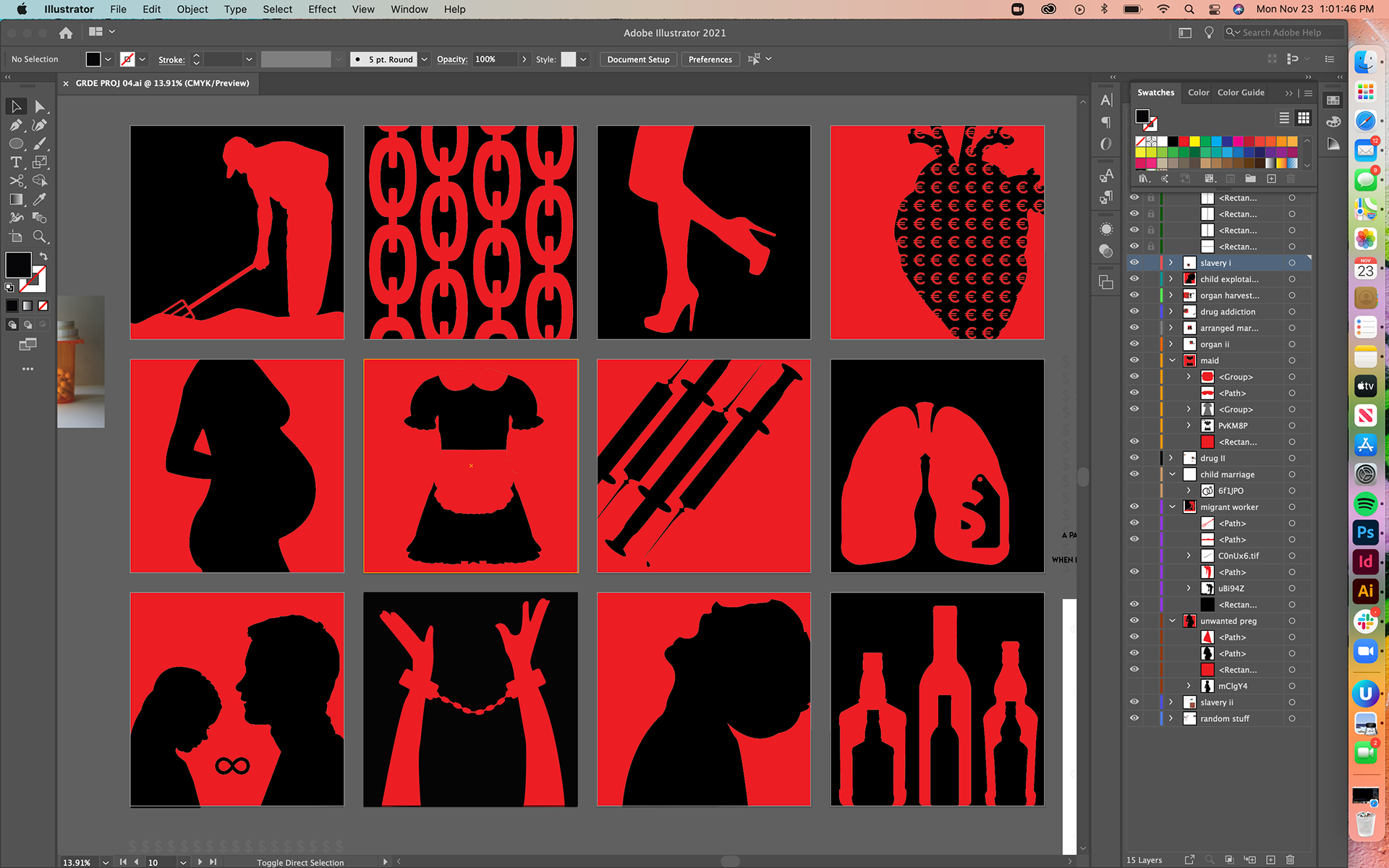
After struggling with how to illustrate these posts, I chose to keep them as silhouetted images with no text. The starkness of the image speaks for itself, and if more context is needed, it is available in the captions. The colors are meant to symbolize the blood, and death, that comes with this despicable trade.
Original portion of this project, 2021.
Poster design to promote the human trafficking app designed, 2021.
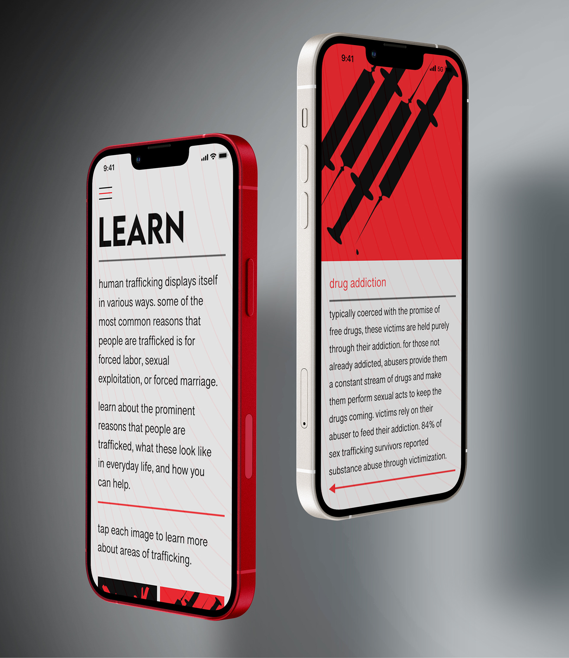
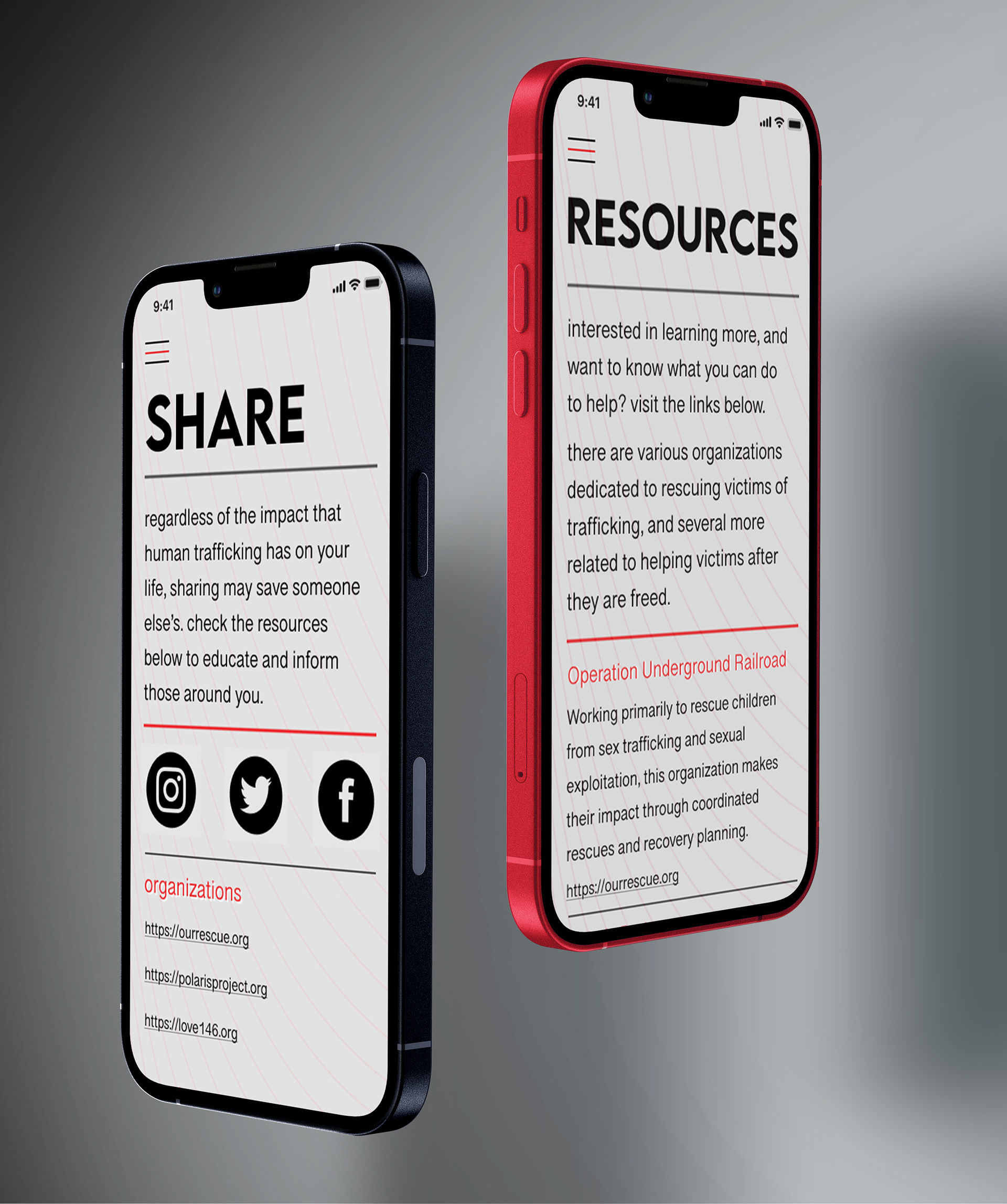
Apple store page for my app "End Human Trafficking."
Final Print Designs
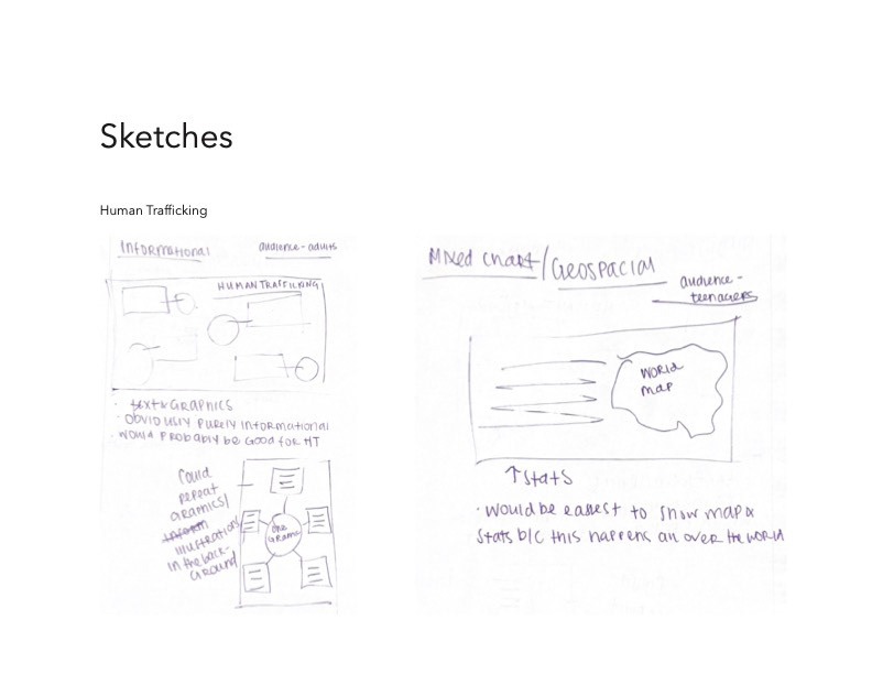
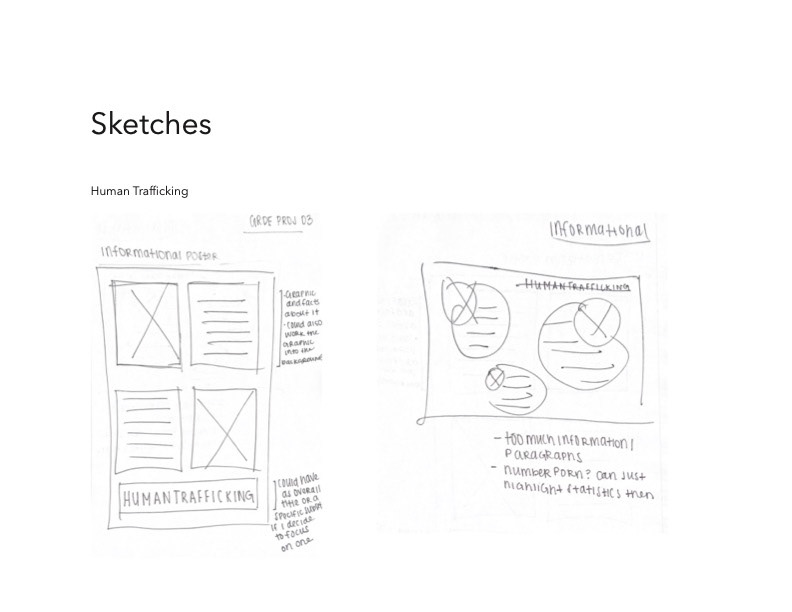
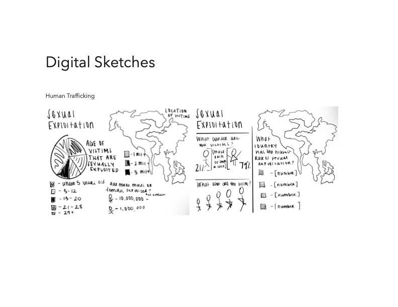
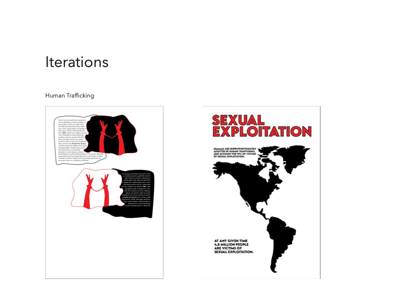
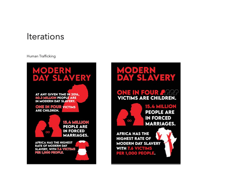
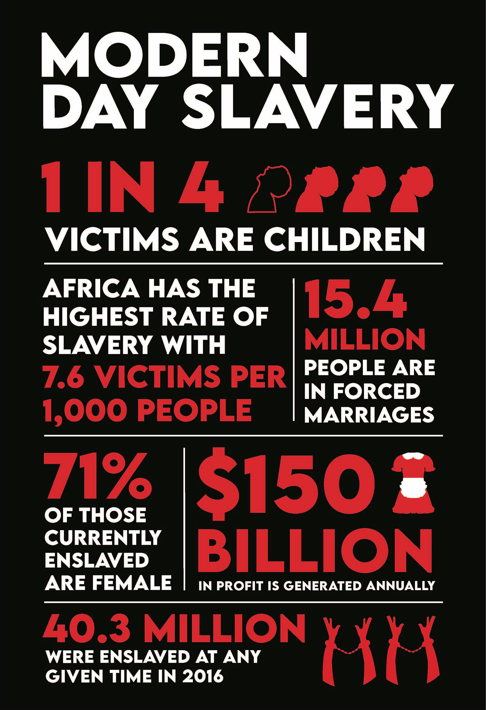
Focusing on purely the statistics of human trafficking, I started researching the different types of infographics. After searching, I landed on number porn and mixed chart, I sketched out my ideas while working closely with my research. When jumping on the computer and finishing up the final comps, I knew that I wanted to keep the same colors to ensure continuity of my designs, while still portraying the severity of the topic.

Research
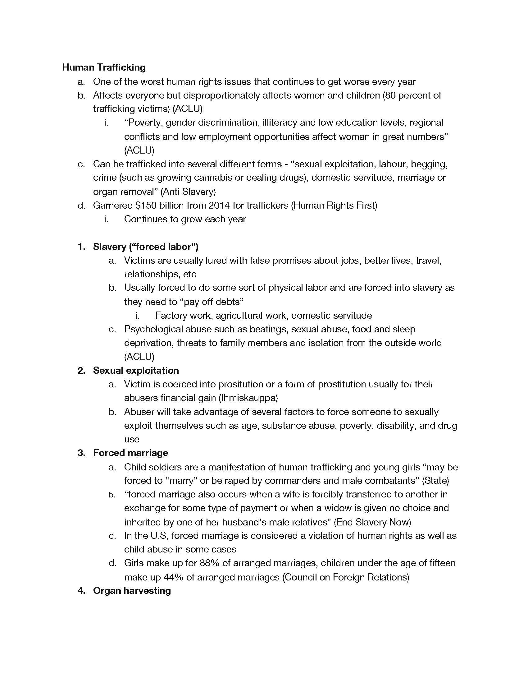
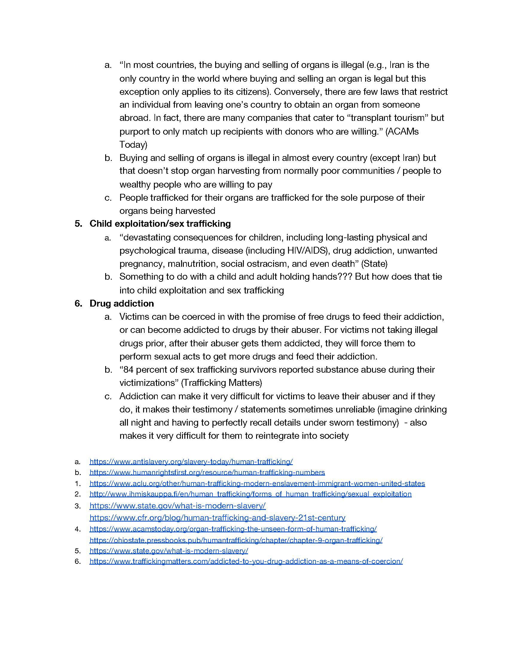
Beginning with extensive research spanning several sites, I outlined my subtopics - slavery, sexual exploitation, forced marriage, organ harvesting, child exploitation, and drug addiction. In addition to my subtopics, I gave a short outline of human trafficking. Throughout my research, I focused on the broad statistics to be able to easily translate them into designs. I wanted my campaign to be informational and a call to action for those viewing it.
I
II
Graphics Sketches
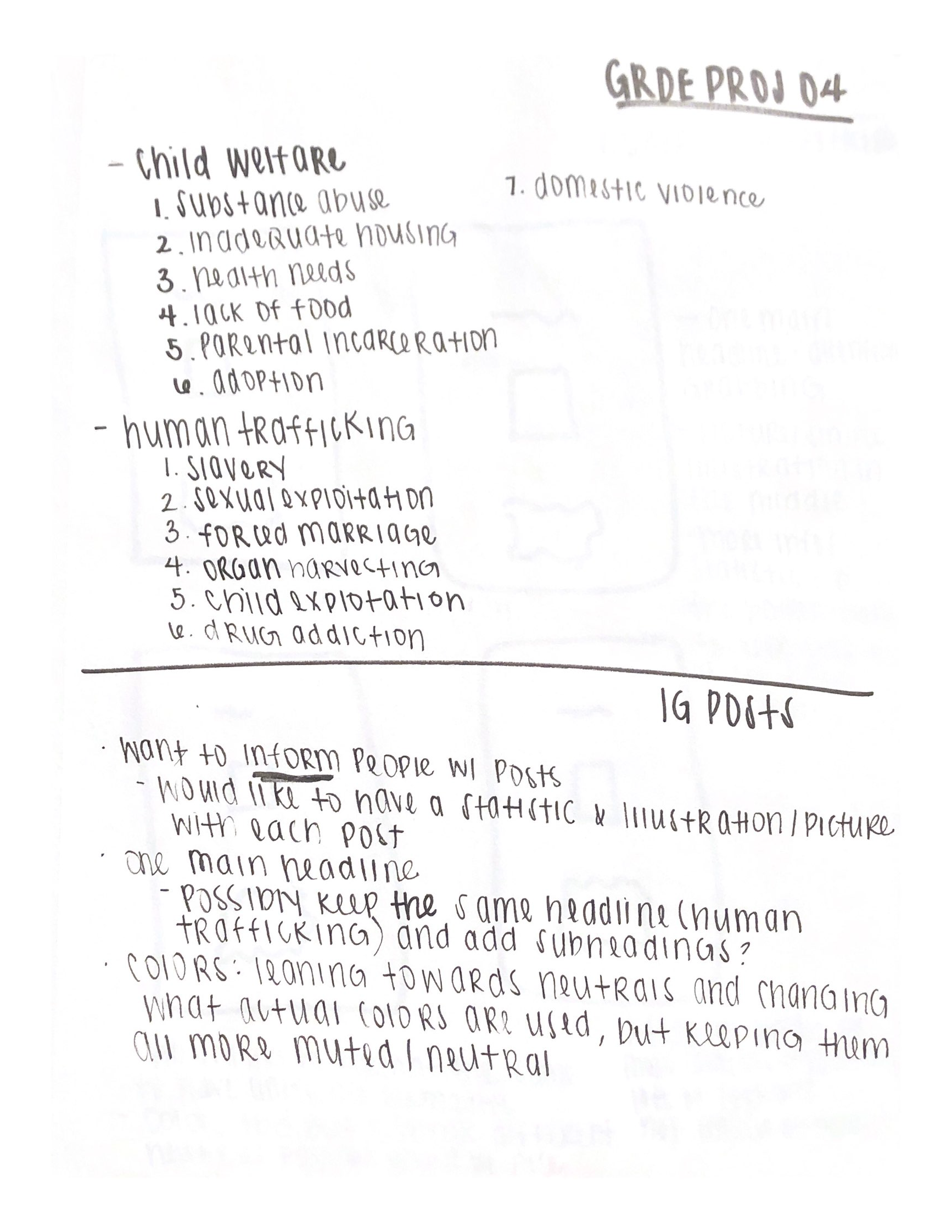
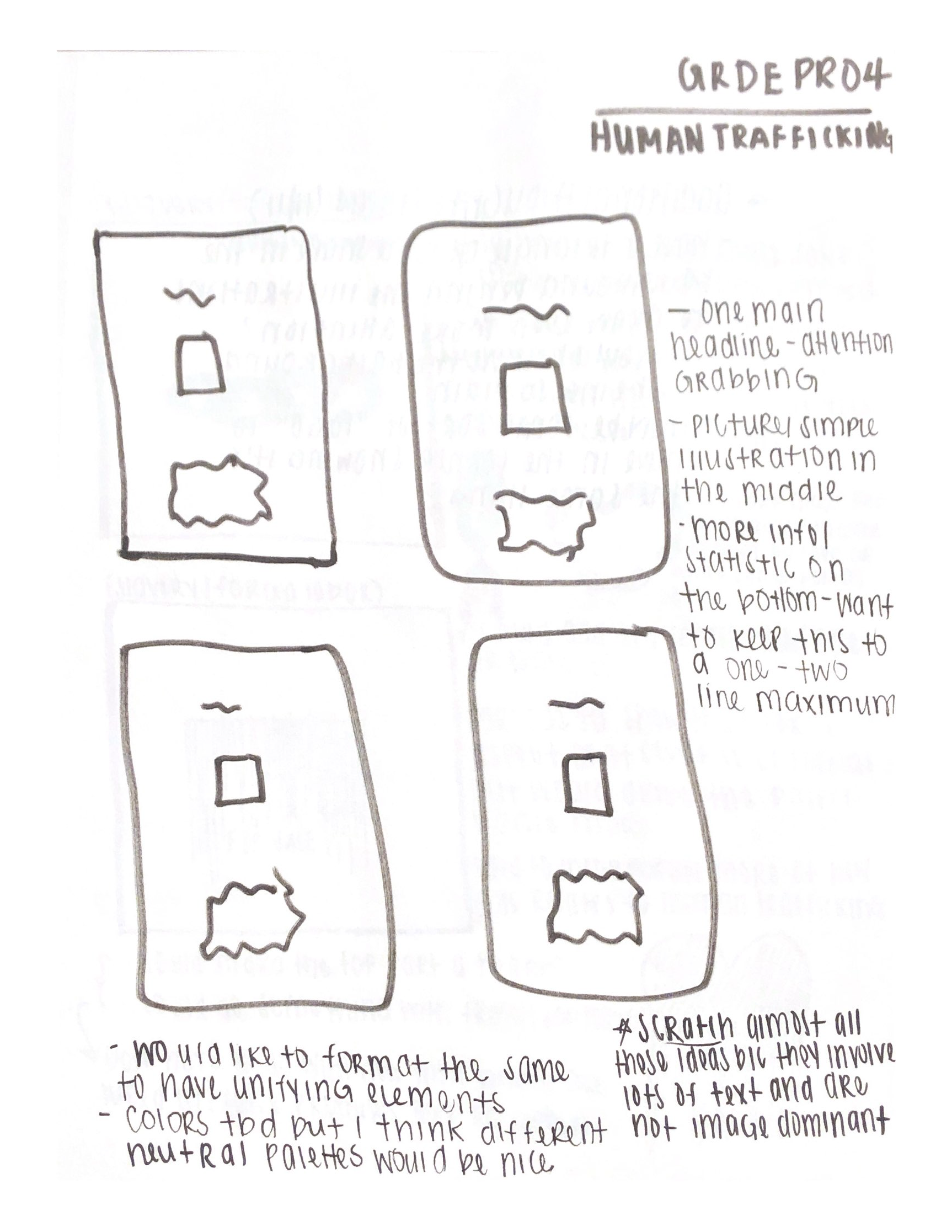
In the midst of researching my topics, I began my sketches. At the beginning of this project, I immediately envisioned bold graphics with a statistic somewhere on the page. During the beginning stages, as seen in my sketches, I desperately wanted to include text and feared if I didn't, people would have no idea what my illustrations were supposed to be. Ultimately, the illustrations were kept simple; bold, centered, and uncomplicated; so they are able to stand without text and be a graphical representation of human trafficking.
II
II
Graphics Process
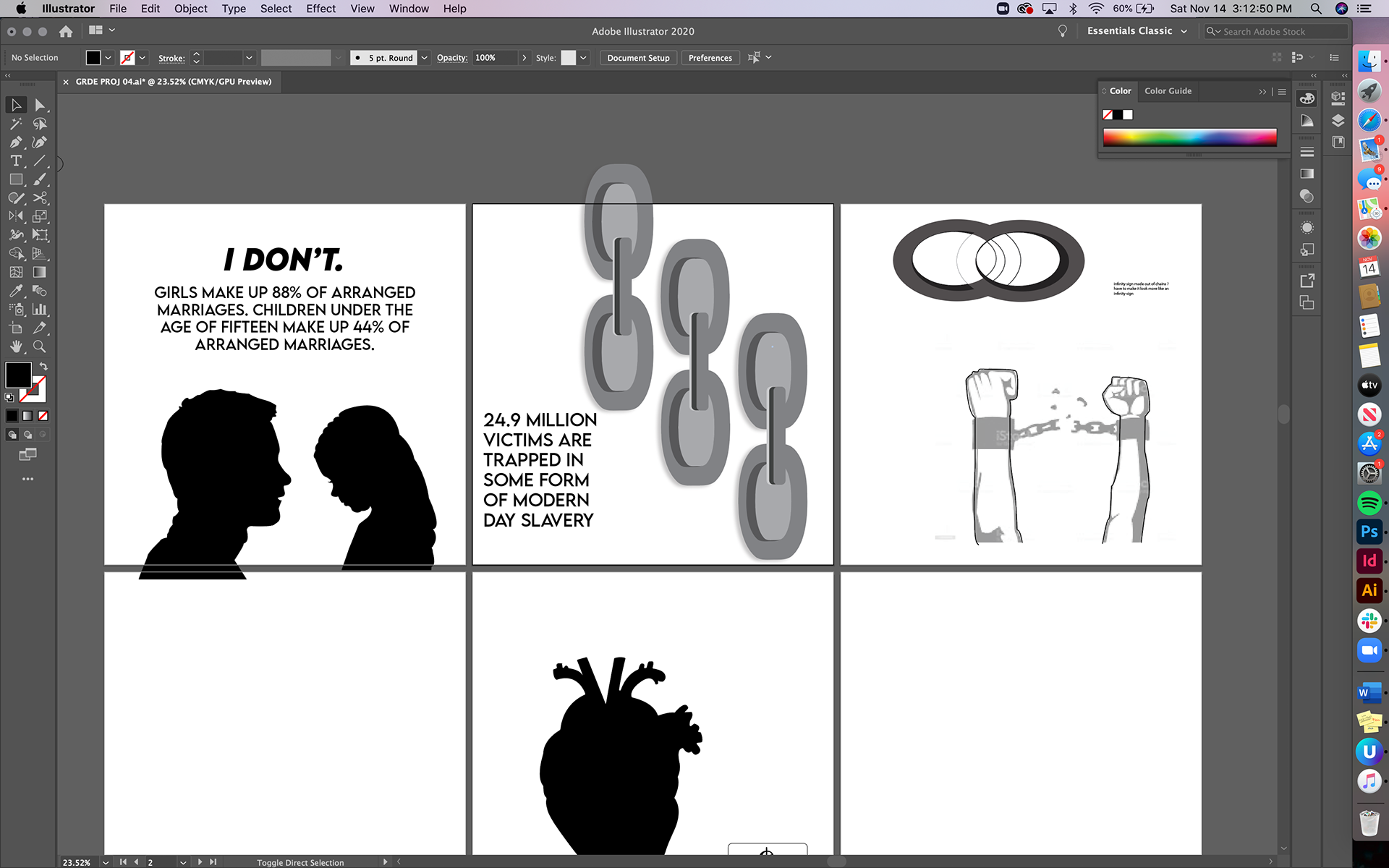
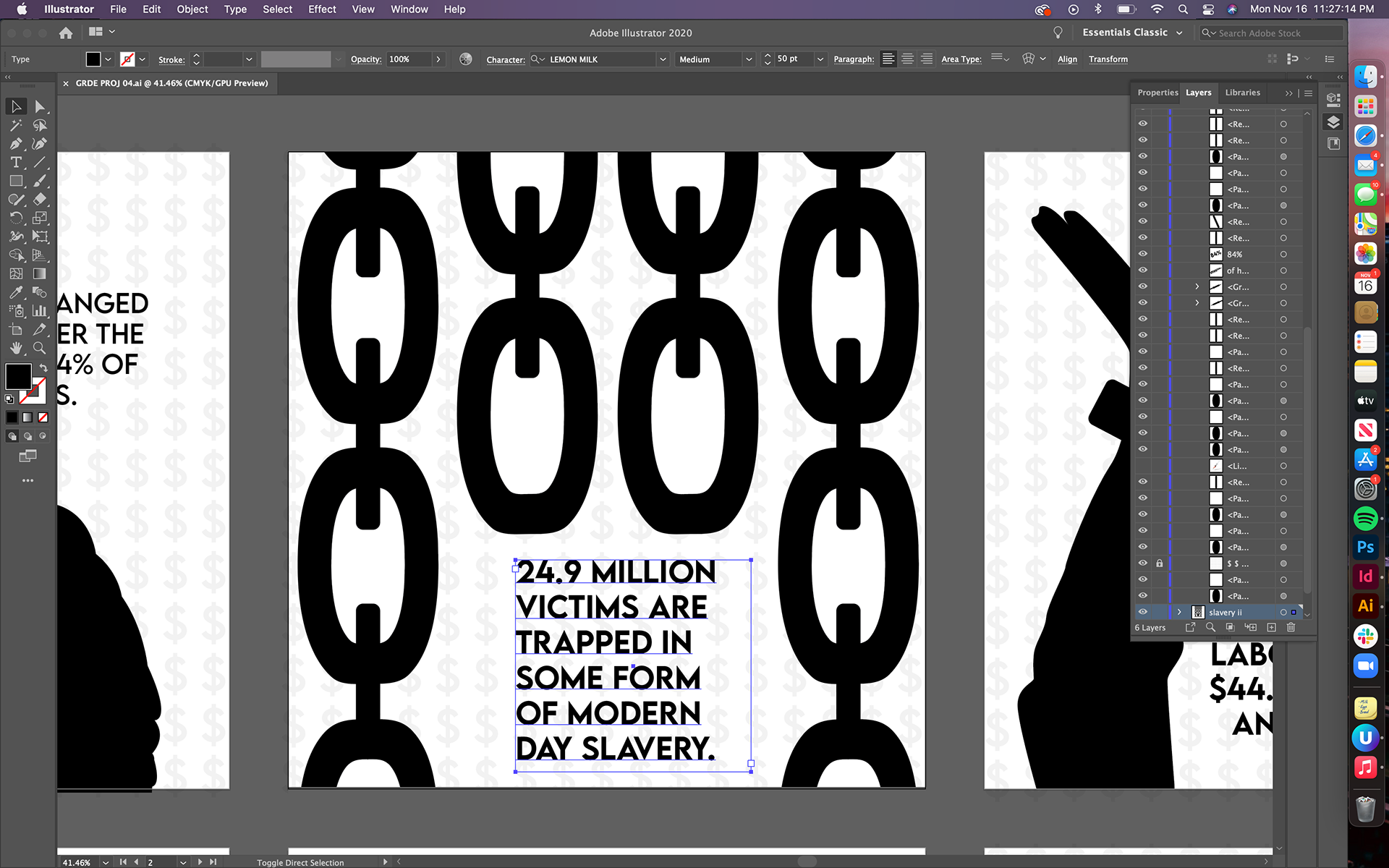
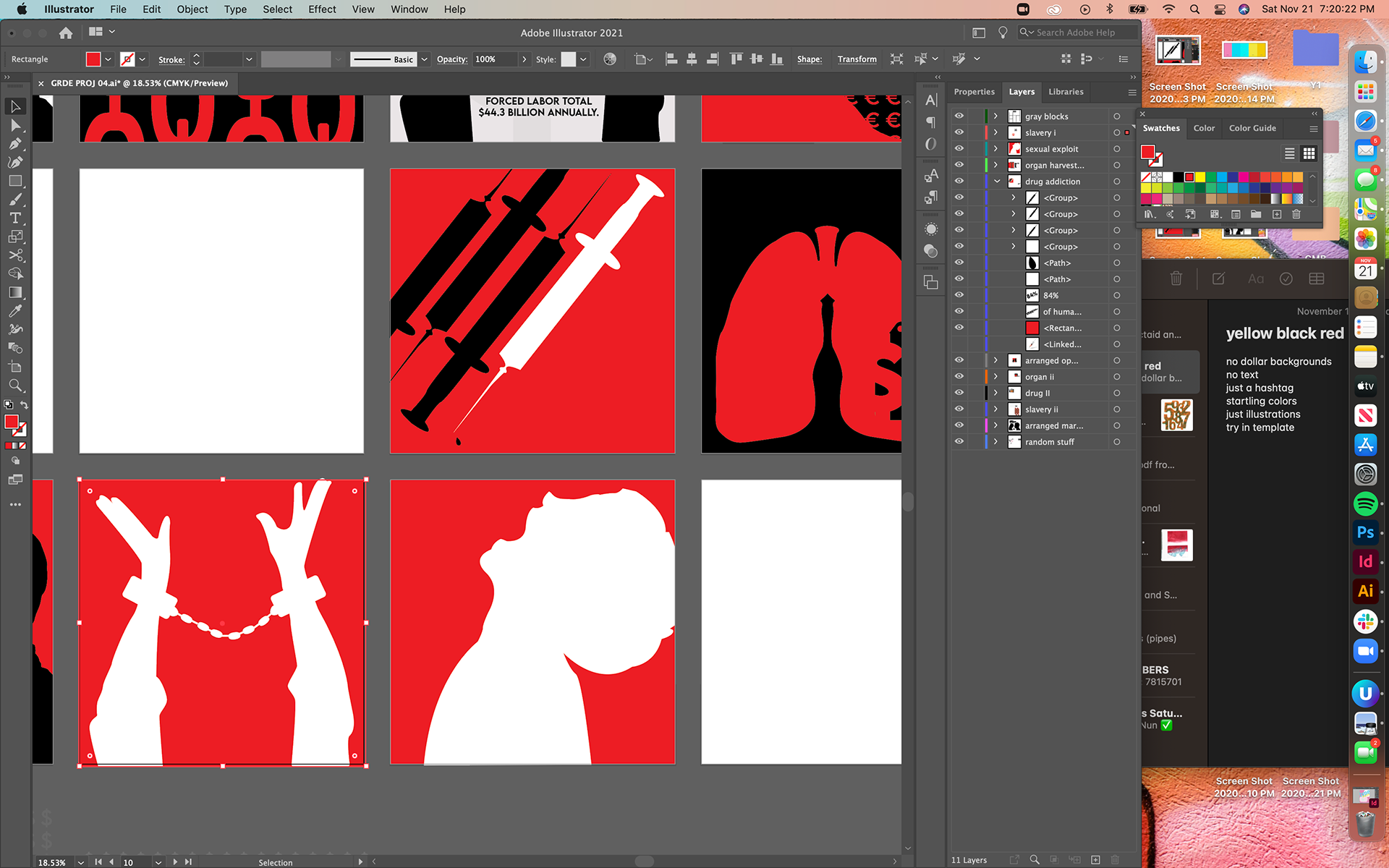
Starting in Illustrator, I thought that these would be very detailed, with shading, drop shadows, and all that good stuff - but that idea quickly failed. After much experimentation with the chains and trying to get those right, I decided to illustrate purely with silhouettes. I wanted these to be as bold as possible, especially after I eliminated all of my text to draw attention to the graphics. I chose the colors red and black for their high contrast, as well as the violence that red invoked.
App Process
The driving force of my app was to bring education and awareness to human trafficking. Beginning with sketches, a site map, empathy maps and personas drove me to the different versions of my app that I had, and the information that I included. The graphics designed for the beginning of this project were also included to tie all parts of the project back together.
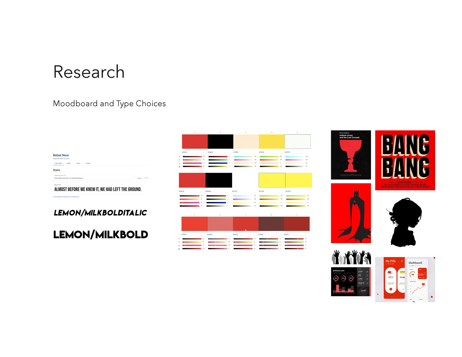
Moodboard, including type and color studies.

Site Map.
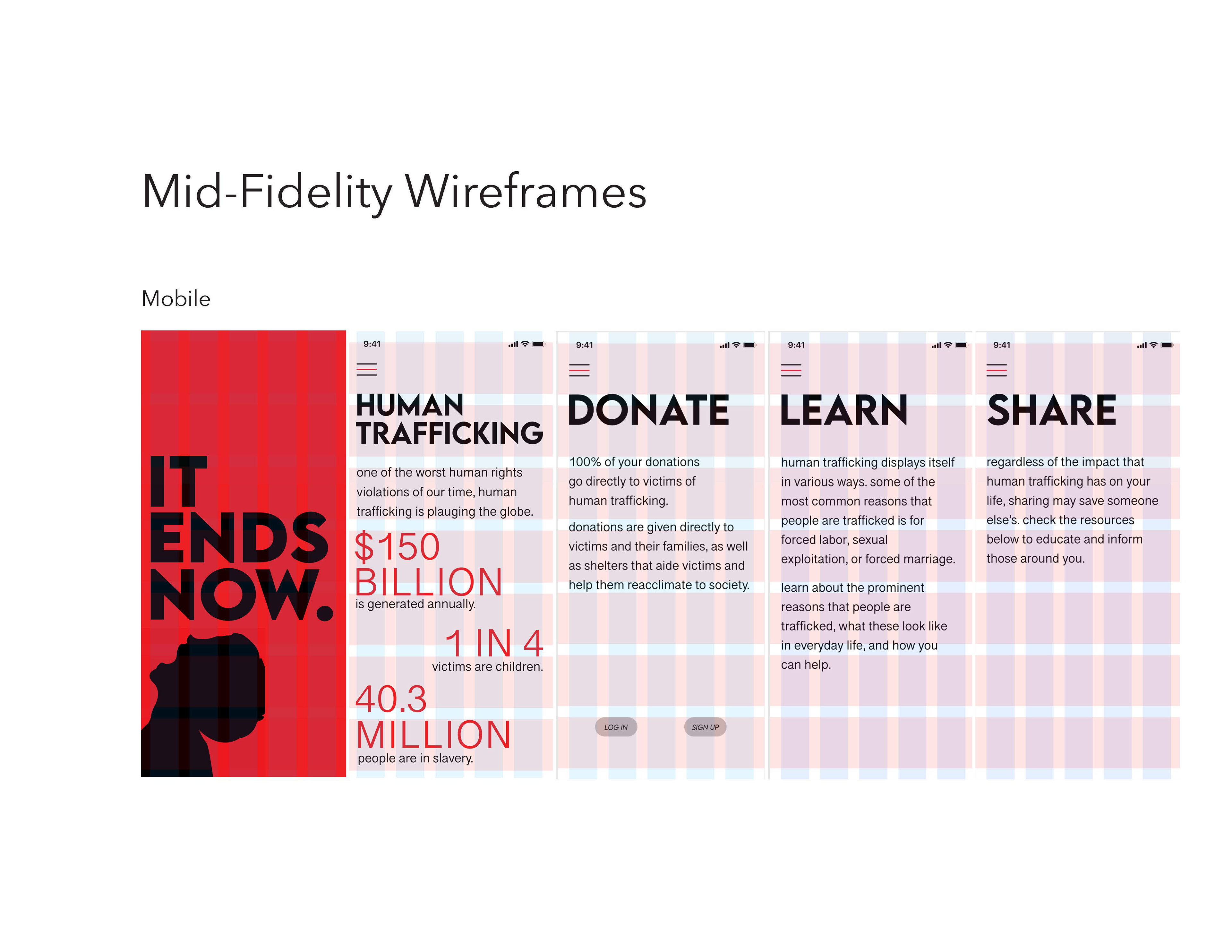
Mid fidelity wireframes.
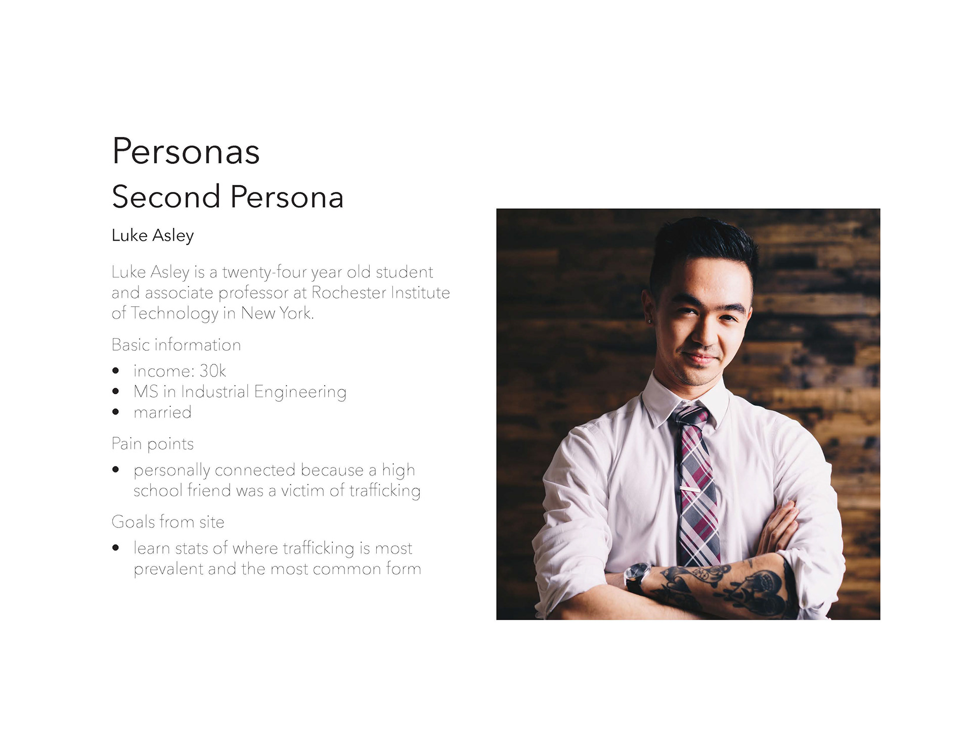
Persona.
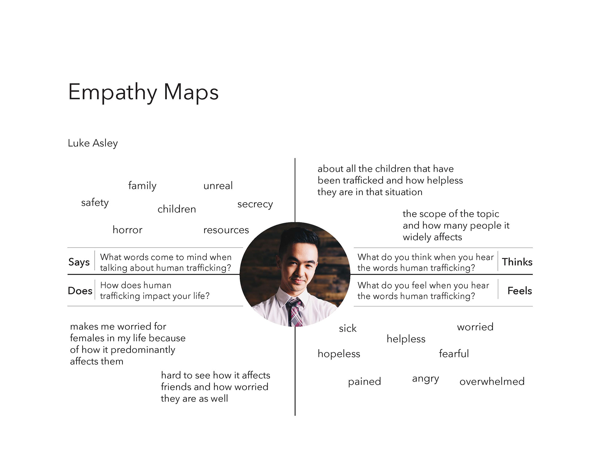
Empathy map corresponding to second persona.
Poster Process
After researching potential infographics to focus on, I sketched out ideas for the top few, and began moving into digital sketches. Before I began sketching, I knew I wanted to incorporate the same colors, hence the use of color early on in the digital iterations.
