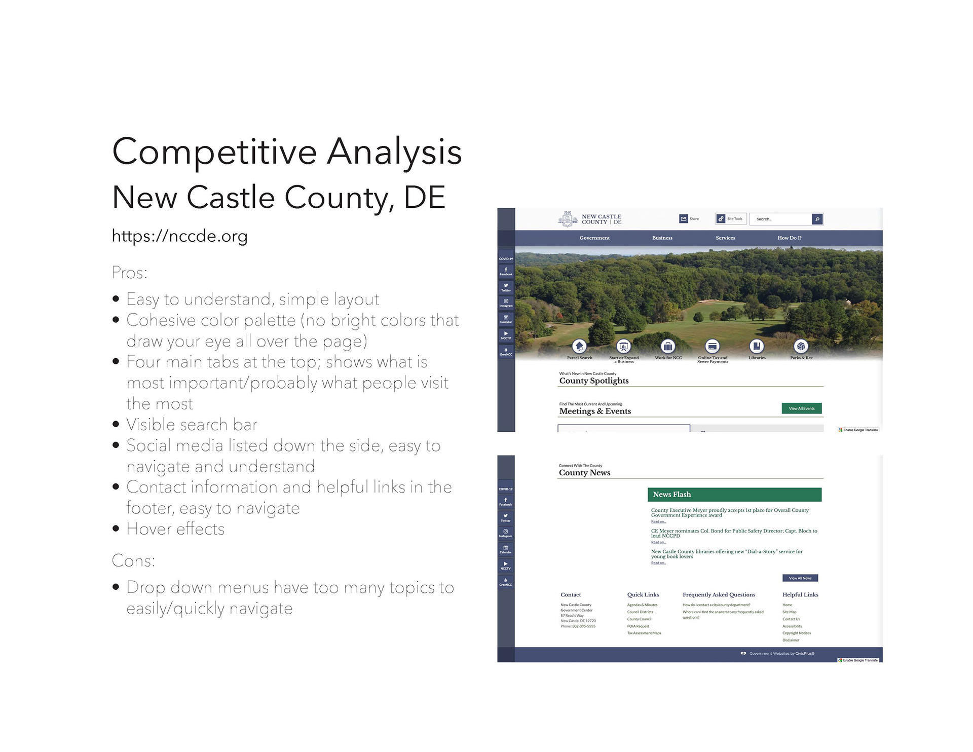
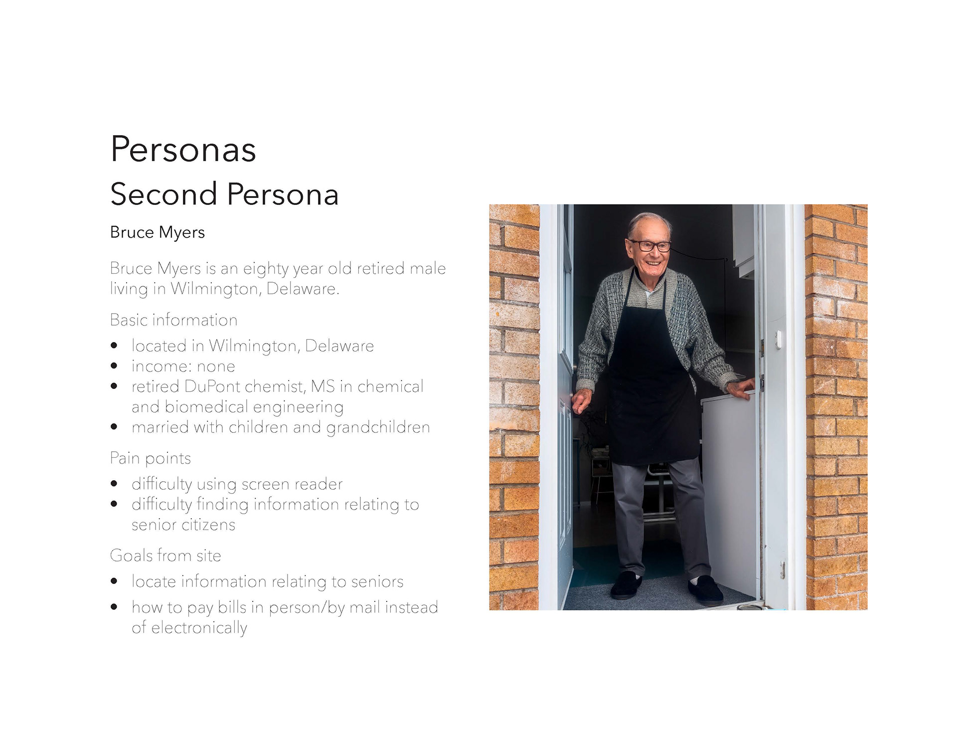
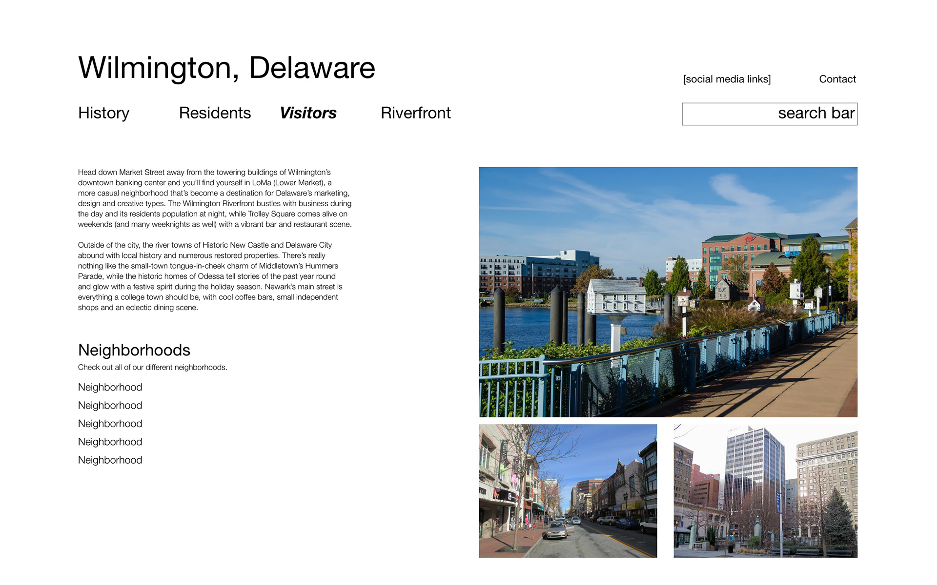
Tasked with redesigning my hometown's website, I decided to keep my designs minimalistic and easy to navigate, focusing on the user experience. Using various processes including competitive analysis and user research developed into personas, I created pages based off what the users most needed and what they were most likely to use. This project was designed and prototyped in Adobe XD.
Final Design
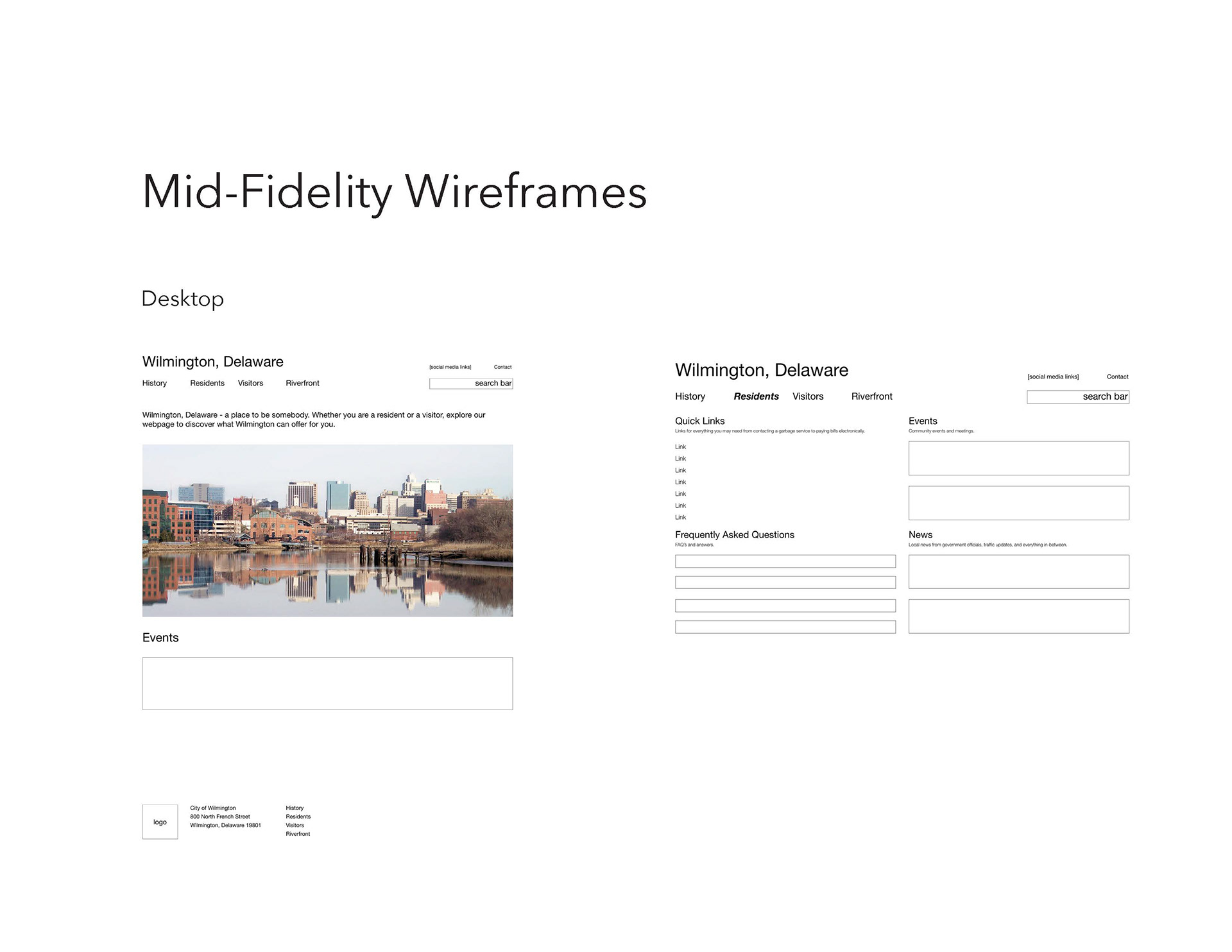
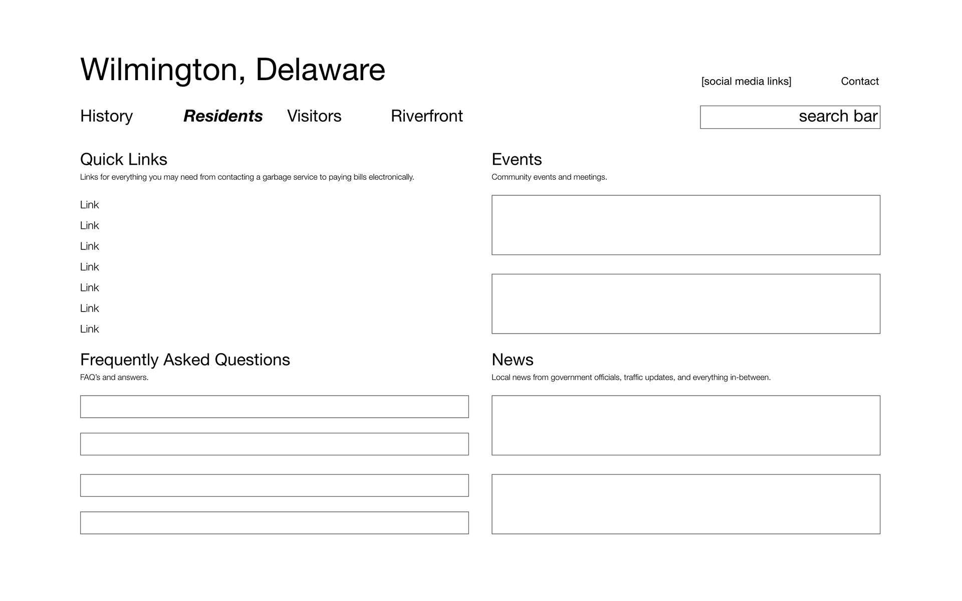
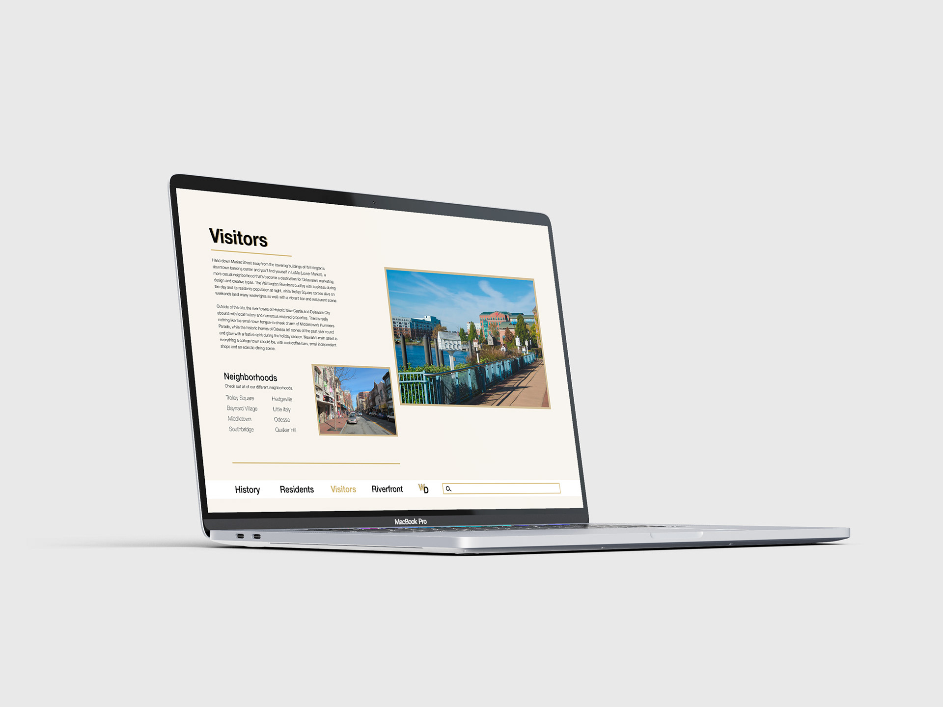
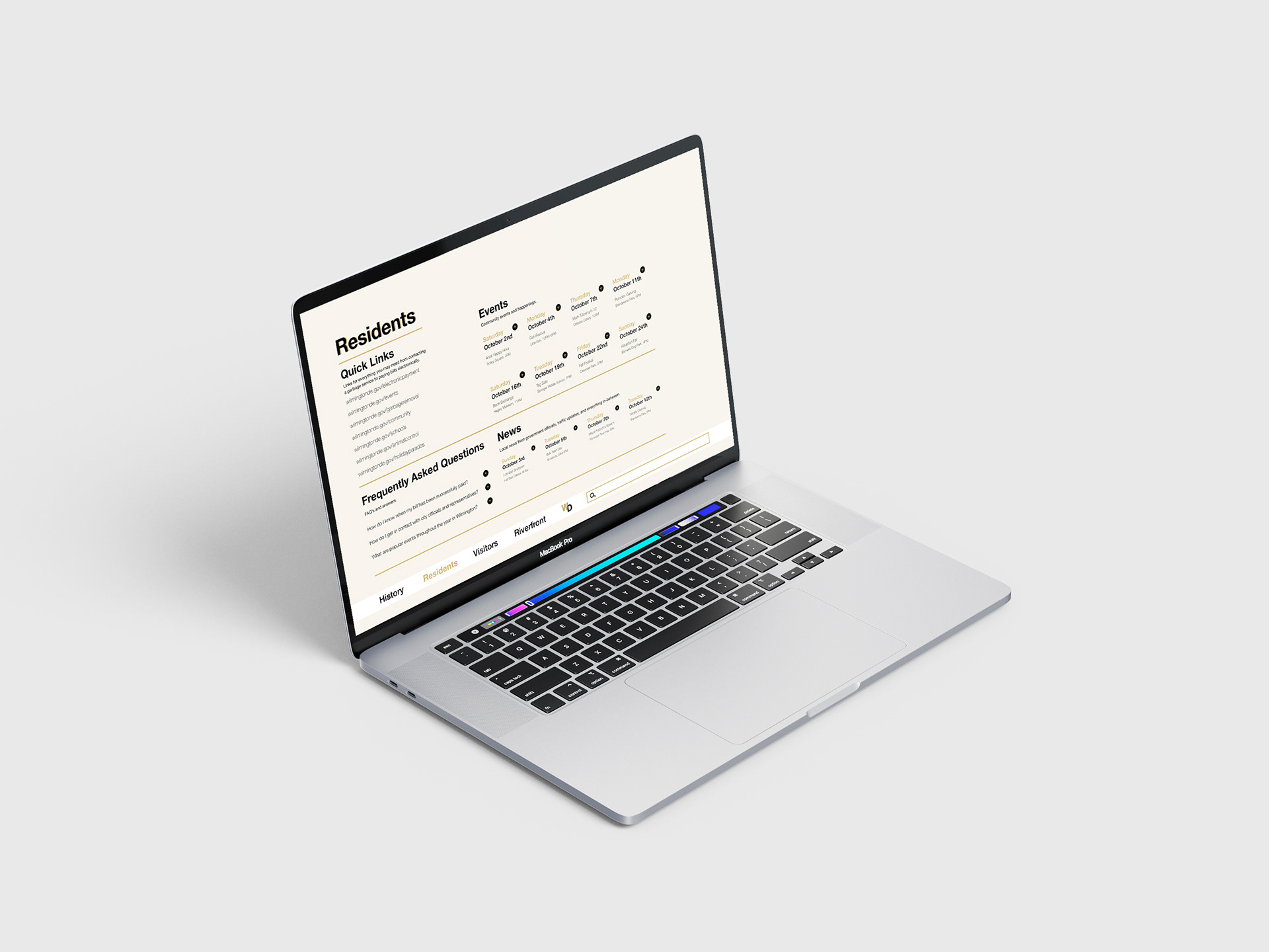
Using the same page structure as my mid-fidelity wireframes, I moved onto my high fidelity wireframes. As I began working, I realized that I did not like the navigation bar at all, and began to experiment with it at the bottom of the page. After some experimentation, I was able to find the positioning that I was happy with. I added all colors and body copies, as well as picture borders and page backgrounds. Moving onto prototyping, I connected all pages and included user-centric feedback, such as hover states and weight and color changes on the events pages. I changed the color of the current page that users are on, so their location is always known.
Process
Beginning with research about my hometown, Wilmington, Delaware, I dove head first into all things Wilmington. I focused on the pages that I saw highlighted multiple times across the site, and noted those to include in my website pages. I surveyed other sites through competitive analysis, two of which included Annapolis, Maryland, and Bergen County, New Jersey. I created mood boards, color palettes and type studies to truly capture the mood of what I wanted my site to radiate. Based off the information I collected from my competitive analysis, I created my personas and used them to further shape the pages my website would have. After all of the beginning user research was done, I started my mid-fidelity wireframes, and refined them until them became my high-fidelity wireframes. I moved onto prototyping and included several user-centric features, including hover states.
